As with my facial skincare [main and supplementary routines], the goal is to keep my naturally very dry skin moisturised without irritation, an especially tricky proposal in winter, so that I can then forget about it and use my hands for other things than scratching myself to death.
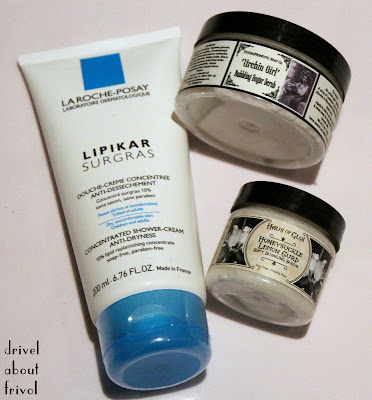
![]() A soap-free, non-drying body wash makes a huge difference to how comfortable my skin feels -- I've learned through experience that even the richest moisturisers afterwards can't compensate for a harsh cleanser. La Roche-Posay Lipikar Surgras [ingredients] is my current favourite; for summer / humid climates / active bouts of eczema or irritation, I switch over to the lighter Lipikar Syndet [ingredients]. Please note that both of these shower gels contain niacinamide, sodium laureth sulfate, and Surgras also contains fragrance. If you dislike products which leave a slight 'film' on the skin, avoid Surgras.
A soap-free, non-drying body wash makes a huge difference to how comfortable my skin feels -- I've learned through experience that even the richest moisturisers afterwards can't compensate for a harsh cleanser. La Roche-Posay Lipikar Surgras [ingredients] is my current favourite; for summer / humid climates / active bouts of eczema or irritation, I switch over to the lighter Lipikar Syndet [ingredients]. Please note that both of these shower gels contain niacinamide, sodium laureth sulfate, and Surgras also contains fragrance. If you dislike products which leave a slight 'film' on the skin, avoid Surgras.
Scrubs can be tricky for delicate skin, but the Haus of Gloi Soft Bubbling Scrubs are a good balance of effective and gentle for me -- the sugars dissolve quickly enough into a light, clean-rinsing foam that even a bout of overenthusiastic buffing [me + sugar + bubbles = enthusiasm an ever-present danger....] won't leave skin red or chapped. The dinky 2oz. sample sizes are a perfect way to experiment with the plethora of HoG scents on offer, and each $3.50 tub, used once weekly, lasts me a full month.
If a slightly stronger exfoliant is needed for elbows, knees and arse, I reach for FuturePrimitive Soap Co. Bubbling Sugar Scrubs, which are a bit more scrubby and a bit less foamy than the Haus of Gloi Bubbling ones, but which are gentler than the Haus Emulsifying Scrubs. The Future Primitive scrubs also rinse clean, and their scents tend to suit my olfactory preferences more (and layer better with my perfumes) than the foodier Haus of Gloi offerings; being a UK indie brand, there is quicker/cheaper shipping to enjoy as well.
As a general rule of thumb for dry, sensitive skin, keep your showers short and not too hot, and shower in the evening so that your skin can dry properly and absorb any moisturisers before being exposed to cold winter air.
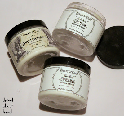
![]() But with my holy grail moisturiser, I just have to shut up and cough up the price of international shipping every few months. Having tried every readily available option, and many an indie one besides, Haus of Gloi Pumpkin Butters remain the best at keeping my skin soft, comfortable and eczema-free. While not the thickest or most emollient, they are definitely the most efficient body butters I've tried, and the gorgeous 'whipped' texture is light enough to smooth with no effort in no time at all (no boring 'warming between hands' or 'rubbing' or other esoteric and faintly kinky speshul application skillz required), and sinks in immediately even in a humid Hong Kong summer.
But with my holy grail moisturiser, I just have to shut up and cough up the price of international shipping every few months. Having tried every readily available option, and many an indie one besides, Haus of Gloi Pumpkin Butters remain the best at keeping my skin soft, comfortable and eczema-free. While not the thickest or most emollient, they are definitely the most efficient body butters I've tried, and the gorgeous 'whipped' texture is light enough to smooth with no effort in no time at all (no boring 'warming between hands' or 'rubbing' or other esoteric and faintly kinky speshul application skillz required), and sinks in immediately even in a humid Hong Kong summer.
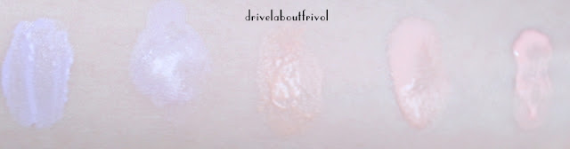
Never a fan of gourmand scents, most of the Haus flavours are far too sweet for me (the scents I can enjoy in a scrub are magnified in pumpkin butter form), so my usual seasonal order (a 6 oz. jar lasts me a month) consists of two tubs of the unscented Aether and one other for variety. Apothecary (shown here) is mostly lemongrass on a faintly woody-herbaceous base, and my other favourite from the permanent line; noses being subjective, this light citrus might smell more 'neutral' to some than Aether, with its untempered shea/pumpkin/coconut components.
For enquiring minds, the limited edition seasonal scents I do like and repurchase: Three Treasures, Snow Wolf and Plotter's Breakfast (Yule), Samhain (Fall) and Something Hopeful (Valentine's, sometimes -- I hope they bring this back next year).
![]()
![]()
CLEANSE
Scrubs can be tricky for delicate skin, but the Haus of Gloi Soft Bubbling Scrubs are a good balance of effective and gentle for me -- the sugars dissolve quickly enough into a light, clean-rinsing foam that even a bout of overenthusiastic buffing [me + sugar + bubbles = enthusiasm an ever-present danger....] won't leave skin red or chapped. The dinky 2oz. sample sizes are a perfect way to experiment with the plethora of HoG scents on offer, and each $3.50 tub, used once weekly, lasts me a full month.
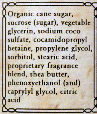 |
| Haus of Gloi Honeysuckle Lemon Curd Soft Bubbling Scrub ingredients |
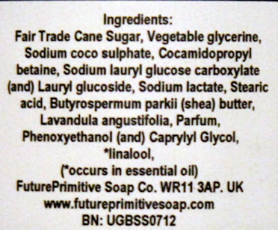 |
| FuturePrimitive Soap Co. Urchin Girl Bubbling Sugar Scrub ingredients |
MOISTURISE
 |
| Haus of Gloi Aether Pumpkin Butter ingredients |
For enquiring minds, the limited edition seasonal scents I do like and repurchase: Three Treasures, Snow Wolf and Plotter's Breakfast (Yule), Samhain (Fall) and Something Hopeful (Valentine's, sometimes -- I hope they bring this back next year).
HANDS AND FEET

...don't necessarily require special / additional products, so listen to your own skin. Since I have Raynaud's (which affects extremities), do a lot with my hands and walk everywhere, separate products do help. Herby Crabtree & Evelyn Gardeners Hand Recovery (a coarse-grained salt scrub which leaves palms and cuticles soft and coated in oils -- I wouldn't use this on the thin skin on the backs of hands) and Hand Therapy (a matte, instantly absorbed but effective moisturiser) have been staples for years. I use the scrub once a week and keeps tubs of the cream everywhere -- I can get on with whatever I want to do immediately after application without leaving sticky, greasy handmarks.
In my bag, a rotation of travel-sized Japanese drugstore handcreams -- currently Shiseido Hand Cream -- which are usually scent-free, quickly absorbed to wear under gloves and carefully packaged never to explode/spill all over the rest of the stuff I tote around.
CCS Heel Balm contains 20% urea, higher than most UK drugstore offerings, and slathered overnight over feet (optionally topped with cotton socks) helps to keep them soft and prevent cracks.
EMERGENCIES
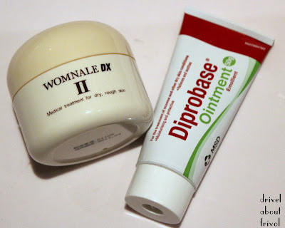
I was prescribed both of these basic treatment creams by doctors: Womnale DX II is a healing Japanese drugstore 20%-urea-and-hyaluronic acid mix (miraculously elegant texture for a urea cream and never stings), while Diprobase is a barrier-forming paraffin ointment, cheap as chips in the UK. All the blather above ensures that I rarely suffer from eczema / chilblains / cracked and chafed skin any more, but I still keep these around as insurance: a quick slather when early warning signs of sore skin manifest usually nips things in the bud.