Quantcast
Channel: drivel about frivol
Viewing all 208 articles
Browse latest View live

Wooly Wednesday: Colourwork

$
0
0
As this neverending winter of our discontent shows no signs of letting up, my makeup review backlog is growing exponentially, the piled-up products to be swatched/photographed forming a prodigious ziggurat which periodically gets smited (i.e. when I trip over the damn pile in the dark) in true old testament fashion, but, like, with more glitter....

So in the meantime, some swatches and colour combos of a different kind, assuming anyone made it through that paragraph, ha. Because I am exploring new knitty territory! And it is called colourwork (and lo, there was much prostration and keening throughout the land my brain).

My primary tour guide is Melissa Leapman's Mastering Color Knitting, clarity of thought and photos making up for its lack of hi-larious '70s styling [for which check out Sarah Don's Fair Isle Knitting. Seriously. :D]

She lucidly skims through colour theory,

shares a few dozen fairisle motifs,

and includes separate chapters on, for example, double knitting

and intarsia

each with its own potted histories, how-to diagrams, design notes/possibilities and example patterns, though this isn't primarily a pattern book -- none of the ready-written patterns appeal to me at all as things to wear/make and yet I found them very helpful just to read through to see Leapman's design process.

What I enjoyed most is the lack of pre- or proscription in this book which makes many of the most revered knitting gurus out there unbearably grating to me. Leapman isn't totally "anything goes, man, go forth and tie knots in the breeeeeeze" but she gives you 'the rules' in a hedged-by-quotation-marks way which actively encourages knowing deviations, and, well, play.


Unfortunately I am on a yarn diet (with occasional falls off the wagon to be sure), which means stash-diving to come up with colour combos for projected projects. So far:

1. Totoro Mittens
I know, grey would've been awesome. But these make a nice, totally organic-sustainable-undyed-British-how-green-am-I?, matched pair.


2. Preppy, stripy pullover
Okay, you know how diets should incorporate a little of what you fancy? I have been stalking a particular pattern for so long that the yarn it calls for has just been discontinued. ....How could I say no to 50% off a no-brainer dream boatneck in suitably sitcommy-clashy colours?  Oops.


3. Girly Fairisle Sweater
Back on the wagon: this one is entirely composed of stash yarn and leftovers from other projects. I just hope my maths works out because most of these have also been discontinued.... it may yet turn out to be a vest if I run out of something (grey, most likely) mid-sleeve.

Now with even moar virtue: I've already started swatching for this one, so it may actually happen and stuff :D
I might replace the baby blue with a lighter grey.... 


4. Paper Dolls
By Kate Davies. For yarniacs, that should be 'nuff said, I think?

The hot fuchsberry shade on the right here [which the lovely Anne JF informs me is called Mexican Pink] is a leftover ball of Jamieson&Smith's delicious range of pure Shetland 2 ply jumper weight wool, i.e. the yarn to fairisle in, which also comes in:

Their full range is more exciting to me than any eyeshadow display:

Even the undyed stringy stuff is incredibly sexy. How. Just. HOW. *flails*


How are you all keeping yourselves amused during this miserable season? :) Or if spring has sprung where you are, is it inspiring you to experiment more with various hobbies?

Chicca Enticing Lip Stain and Flush Blush: Review, Swatch, Comparison

$
0
0
Chicca [pronounced 'kicka'] is a Kanebo-owned Japanese high end brand founded by makeup artist Yasuo Yoshikawa [latest work]. I have come to think of it as RMK's big sis, aimed at slightly older, richer folk, but sharing the minimalist cream/white/clear/silver packaging.

It's a brand I found very easy to skip over, owing to its understated aesthetic (even within the context of the understated-posh market), luxury price points and limited distribution, with only five counters across Japan.

...Until I realised that they offered shimmer-free cream blushes and lipstains! It's difficult enough to find either shimmer-free blushes or cream blushes from Japanese brands, nigh-impossible to find both in combination; lip stains are also rare thanks to decade-long trends favouring glossy nude lips or my-lips-but-better sheers.

Nice embossed textured cardboard packaging, bit reminiscent of THREE's.

Enticing Lip Stains are packaged in a sleek, reasonably solid (but not annoyingly heavy) rectangular frosted chrome compact. Flush Blushes are available as refills with square chrome compacts sold separately -- I of course opted for the pan only, which is made of sturdy metal with a dot of the soft glue typical of Japanese brands on its base.

Enticing Lip Stain 02 Amaryllis and Flush Blush 10 Girly Flush, orange- and pink-toned reds

...not that I have a problem with that colour or anything.

Comparisons!
I included a mix of lip and cheek products, mostly creams. Products swatched heavily with weasel brush onto bare arm, pictures taken in natural light.

Lip Stain
Illamasqua Lover cream blush
Canmake cream cheek CL03 Clear Sunset (LE)
RMS lip2cheek Modest
Chicca Enticing Lip Stain 02 Amaryllis
Revlon Strawberry Suede matte lipstick (DC)
Addiction Lip Crayon Le Mépris
YSL Glossy Stain 10 Rouge Laque
ArtDeco Dita Von Teese Art Couture Velvet 615 Muse Red
Ellis Faas Glazed Lips L307


Revlon Strawberry Suede comes closest to Amaryllis, but it has a softer pink-coral tinge; Addiction Le Mépris is also similar, but without Amaryllis' clearer red note. The main point of difference is in texture and finish: both the Revlon and Addiction shades are matte, full-coverage lipsticks, but the Chicca lip stain is a solid balm formula which retains a jellied translucency once on the lips, even when built up to full opacity with a brush. Sheered out, the Chicca is an almost-textureless tint which hugs the lips so closely it does justify (or explain) the name 'lip stain', even though it does not, in fact, stain, completely vanishing after a meal*. Neither highly moisturising or drying on me, its lightweight balm feel enables me to skip a separate lipbalm underneath, to take full advantage of its textural invisibility, especially pressed on with a finger tip -- the solidity of the formula makes it so neat (no high-slip risk of bleeding or smearing here) that even I can be persuaded to skip the lip brush.

*much like Laura Mercier's potted 'lip stains', which are really demi-matte lipsticks that sit exceptionally close to the lips, but which also don't function as stains proper.


Flush Blush
Sleek Pink Sprint Trio Pink Parfait
Canmake Cheek Cream CL04 Clear Pink Joy
Vapour Aura Stain Impulse
Besame Crimson Cream Rouge
Chicca Flush Blush 10 Girly Flush
By Terry Rouge Terrybly Hot Cranberry
Guerlain Rouge Automatique Champs Élysées
Revlon Super Lustrous Cherries in the Snow


Even without centring it deliberately, Chicca Girly Flush would probably end up in the middle if I'd swatched by red-to-pink or by cool-to-warm -- it's the most balanced of these shades. That said, once blended out, it is nearly indistiguishable from Besame Crimson Cream Rouge, which will therefore be heading out -- I prefer the (famed, Japanese!) translucency of Chicca's finish and the fact that it's totally scent-free (as opposed to Besame's unscented and therefore faintly waxy-ingrendientsy smell); both blushes are quite solid and low-slip for creams -- Besame is more  of a cream/wax, while Chicca has an unusualbalm-stain feel with a unique clear gel finish on the skin, like no other blush formula I've ever tried before. The closest comparison would be the Kjaer Weis cream blush formula (I own Lovely), but while similarly unsticky and balm-like in feel, in finish Kjaer Weis is more of a conventional sheer cream versus Chicca's clear jelly.

Just as the unusual lip stain texture got me to ditch my lip brush, I experienced a bit of a learning curve with this balmy flush blush, finally achieving the best results by using pressing/patting motion to 'stamp' the blush onto the skin, using a synthetic brush for stronger pigment, or beauty blender sponge for a lighter look.


Look
I shot into try/review ALL THE THINGS mode during a brief moment of sunshine, and apologise in advance for the:

  • dry, flaky, mismatched base (Graftobian HD Glamour Cream Porcelain
  • mismatched concealer colour under and around my eyes (Nars Radiant Creamy Vanilla) 
  • box-fresh new frames with "hand made acetate" on the lenses XD

Hopefully they won't detract/distract too much from the translucent lit-from-within glow of these Chicca products.
lemon face. WHY.
Eyes are a wash of Lunasol Sheer Glossy Eyes EX-01 Nuance Grey, GOSH white kohl and a slick of Maybelline Rocket WP mascara.

The lip and cheek pairing may be clashy to many, but I've decided I really like it and will be reaching for it again. As for the temptation to reverse the two, I find the flush blush too sheer to work well on lips and lip tint too 'clingy' to sit well on my dry cheeks -- unlike the Addiction cheeksticks, these are not multipurpose products for me.

Foolproof Face

$
0
0
Easter-induced sugar hangover and British Summer Time kicking in over the one day was a bit much for me to handle, so for this April Fool's Monday I reached for some of my current favourite foolproof products (see what I did there) to put together a no-brainer taupink look.


Kiko Long-Lasting Eyeshadow Stick 05 Rosy Brown // By Terry Ombre Blackstar Misty Rock
Kjaer Weis Lovely Cream Blush
By Terry Rouge Terrybly Hot Cranberry
Clio Eyeguard Waterproof Liner


Eyeshadow Sticks
I've drivelled about how awesome the Kiko sticks are in their original review post -- slick on, blend edges, and bam! complex neutral eye look that stays indelible for over 24 hours (for yes, I am a bad straight-into-bed-collapser at times). Today I wanted to show my mother just how close my Kiko 05 Rosy Brown came to her By Terry Ombre Blackstar Misty Rock, both in formula (cf. former Topshop flailings as well as the Kiko post) but this time, also in colour.


Scribbled swatches. First two pics in natural light, last pic taken with flash.

Misty Rock is more tightly packed with finer shimmer particles -- something evident in the tube as well as on skin, but if anything I think Rosy Brown's more diffuse sparkle catches the light in a prettier, more complex way. Although I admit I'm really picking nits now, because you can totally get away with wearing one on either eye without anyone noticing....
  By Terry Misty Rock   Kiko Rosy Brown  


Cream Blush
If you saw my last post you will know I don't exactly have a shortage of cream blushes. I prefer them to powders by far, and have been in the process of gradually converting my entire collection of blushes to cream formulas*, as new shades become available to me. Kjaer Weis Lovely is all Grace's fault. Ahem, I mean, it's a clear, rosy pink in a solid cream-balm formula, semi-sheer but easily buildable and blendable -- I defy anyone to achieve clown cheeks with this gloriously foolproof, goes-with-everything, face-brightening flush -- which feels comfortable and looks naturally healthily dewy even on my winter-dry cheeks.

Lovely is deeper and rosier than the other softer functioning-as-nude pinks I own (Rouge Bunny Rouge Gracilis, the right side of Suqqu Balancing Cheeks 01Momozoe and Lipstick Queen Oxymoron Matte Gloss Free Ride) but is noticeably softer than the perkier options of Becca Hyacinth, Canmake CL04 Clear Pink Joy or Becca Dragonfruit beach tint. I find myself reaching for it often as the goldilocks neutral-with-a-kick option.

*For the curious, the powder Lovely replaced was Illamasqua's Katie, which is a similar mid-toned warm pink on me -- see the last look here.


Lipstick
For me, truly foolproof means fooling-proof too; give me a long-lasting lipstick that may require a lipbrush for the initial 30-second application over a gloss which requires topping up and mirror-checks throughout the whole day. As mentioned (er...somewhere) in my Lip Love post, By Terry's Rouge Terrybly in Hot Cranberry is one of my very favourite lipsticks in that rarest of formulas: highly pigmented, lightweight and moisturising but very long-lasting. Its high-silicone-slip formula makes precise application a doddle, and the insane pigmentation makes layering unnecessary; the colour, a bright pink-red, gives my face and mood an instant lift, without fail.

This is how it looks at 8:30 am:

And at 6 pm (after 2 meals, a few snacks, and innumerable caffeinated beverages):


Liquid Liner
For a basic line, following the curve of my lashline so closely it's barely beyond tightlining, and extended ever so slightly at the outer edge, a precise pen is much quicker and easier than a gel or powder requiring a separate brush, or a smudgy pencil requiring the subsequent removal of gunk from lashes...

I will review this ergonomic(!) offering from Korean brand Clio along with some other PR samples in due course, but for now, let the fact that it has become my foolproof liner of choice in the space of a fortnight testify to its genuine out-of-the-box ease of use and total lack of learning curve. Foolingproof, too -- this stuff is as indelible as the hardiest Japanese liners I've tried.


Other products: Koh Gen Do Maifanshi Moisture Foundation 001, Tarte Maracuja Creaseless Concealer in Fair, Shu Uemura H9 brow pencil Stone Grey, GOSH white kohl.

Kiko Long-Lasting Eyeshadow Sticks Swatches

$
0
0
A foolproof follow-up: swatches of my full collection (so far) of the delicious Kiko Long-Lasting Eyeshadow Sticks [original review].

The black tubes are all from the core range, while the silver/white ones are limited edition from the spring 2013 Colours in the World collection; they now retail for £6.90 each in the UK but offers roll around a few times a year.


Swatches made onto bare arm, one swipe unless otherwise specified.


01 Pearly White semi-sheer shimmer. Slightly warmed white (like sunlit snow), definitely not silver [3 swipes]
04 Golden Chocolate v. pigmented shimmery brown base with gold sparkle
05 Rosy Brown v. pigmented rose-tinted taupe with tonal sparkle
06 Golden Brown v. pigmented golden brown with old gold shimmer
15 Lilac cool orchid pink with sparse silver sparkle [2 swipes]
16 Purple violet with subtle tonal shimmer [3 swipes]
17 Midnight Blue dark rich blue with sparse copper sparkle [2 swipes]
20 Black true, glossy black (no shimmer) -- a great base for smoky looks
30 Shiny Fuchsia hot pink shimmer
33 Smoky Grey a slightly warm sooty grey (demi-matte)

As you see, they do vary a bit in terms of pigmentation and finish. If my first stick had been Purple or Pearly White, I probably wouldn't have become quite such a devotée, but as it is, these are edging out almost every other cream eyeshadow and pencil formula I own.

Encompassing a great range of shades, both neutral and fashion-led, this line-up beats the likes of Laura Mercier, By Terry or (most recently) Bobbi Brown; in texture and performance I find them every bit the equal of the high end brand offerings.

Spring Magazines: FUDGE, SPUR, So-En

$
0
0
My favourite fashion seasons are the transitional ones of spring and autumn and March-May and September-November are the months for which I amass the largest piles of magazines. Today I finally had the time and inclination (i.e. it's no longer snowing. In London. wtf.) to flip through the April batch and thought I'd give a quick overview of my three favourite Japanese fashion magazines.


Amuse-Bouche: SPUR
Over the last year or so, SPUR has somewhat fallen from its lofty (self-erected) perch as "the intellectual fashion magazine" -- now over twice the thickness of So-En or FUDGE, its extra bulk is entirely due to ads, though it remains both less bloated and more thoughtful than Vogue [pomposity =/= profundity, Vogue, srsly]. The most unreservedly fashion-led of the three, it consequently has less of a coherent editorial voice, and my fondness for it fluctuates depending on how well the latest crop of trends chime with me, but given the sheer range of styles each edition encompasses, it remains a reliable source of tasty fashion tidbits, even if an individual issue is (like this one) generally a snooze-fest of the already-boring 'it' pieces from the big designers, lazily styled.

Anyway. Plenitude being the watchword, here are the yellow and green pages from their smorgasbord of print trousers:

and collaborations:

Although as round-ups go, I like their 'Styling School' series best. This round: Shirts!
I geek out over care instructions :D

This issue also features a random strawberry-themed collection, which I found cute without being too sickening:

....a mood which is carried over into my favourite (least forced) editorial from this month, a perfect sunlit J&M Davidson picnic, shot at angles both intimate and airy:


As for beauty, I am still on my modern '60s kick so very much enjoyed this:

and the powder-wing here is also something I'd like to play with:


Main Course: So-En
The grande dame of the bunch, Japan's first fashion magazine founded in 1936 by Bunka Fashion College, So-En's focus continues to be Japanese-designer-centric and every issue still manages to introduce a new-to-me talent (no mean feat as I've been subscribing since 2000). Its annual So-En Design Prize always throws up incredible eye candy -- check out the current contenders and last year's winner -- and there are occasional sewing patterns to tear out and insightful interviews with various designers to inspire one (well...me) more to study or sew than to shop.

Some of the Japanese brands featured this round (with short designer interviews and beautifully painterly pictures) include:

and with possibly my favourite shot of all, Under Cover:

Some outfits featuring pieces from fifteen up-and-coming designers:

A few pages from a great, weighty chapter on fashion photography through the twentieth century:

But So-En isn't all FASHIN B SRS ART -- there's always plenty of pretty / wearable / approachable / straight-up kyoot to be had in each issue.
e.g. this Sally Scott feature

or this Frapbois outfit

or this Minä Perhonen editorial (surprisingly shadowy / coolly lit!) and a piece on their new Kyoto flagship:


Beauty bits, one which I love in every last detail:
makeup by Yumi Narai


and the other which is an interesting play on low (left) and high (right) contrast brights.

makeup by Sadafumi Ito (NARS Japan)


Dessert: FUDGE
Haters of the girlish and whimsical, either click away or have a barf bucket handy :P For FUDGE is the slightly less wafty, slightly more kicky younger (yeah, even younger) sister of Lula, my favourite English fashion mag. Which means that a) I am too old for this shit, and b) I LOVE IT UNRESERVEDLY. You may think the sunny pictures I'm about to share are peculiar to the spring issues....they're not -- it's always this sweet. Never fails to put a smile on my face and make me want to top up my blush.....


Representative FUDGE model -- red and wayward of hair, freckled and elfin of feature -- and adorabling (rocking would be so inappropriate, no?) a Kusa Kanmuri print scarf.


One of the advantages of FUDGE's determinedly youthful approach to fashion is that they can often make me look again at even brands I particularly dislike with new and naïf/waif-like eyes. This issue, the editors introduce Louis Vuitton to its young readers through its "Brand Pick-Up!" feature:

I just like that it's all done in a fresh, irreverent [this time, through some Tom Sawyer-esque whitewashing storyline] and distantly-aspirational way, recognising that these pieces are beyond most readers' budgets. Diffusion lines and the quirkier domestic brands are its more usual fare:

But back to aspiration, this spin on the standard streetstyle feature sums up for me the likeliest ambitions of the FUDGE girl: "Art School Girl[s] in Paris [and London]"

Paris and London are FUDGE's primary fairylands (New York -- more resistant to their brand of whimsy -- comes in a very distant third), which excels at escapism as a 'young' magazine should. As a chauvenistic Londoner who goes to Paris a few times a year and finds it always disappointing (*ducks*) it can be a bit of a funhouse mirror experience reading seeing my city through this mag's eyes, but thankfully April's is a Paris-bound issue and this Paris is far more delicious than the one I know :P I particularly liked that one of the locations they chose to highlight was a millliner's :D

More escapism, both literal

...and less so (with Vivienne Westwood Red Label)

....and even less so
^this functions as our obligatory beauty shot -- love that orange blush -- and, like the violin in the grass, isn't quite as random as it might seem. A few FUDGE trademarks I've come to recognise over the years: the bathroom/tub shot, the balcony/climbing-out-the-window shot, the kitchen-perch shot, the ladder-perch shot, the random-object-as-hat-shot.... hey, it's still better than Vivi's facial-tic-o-rama. I may be growing up a bit after all :P


Any other magazine addicts? Share your faves or rant away in the comments <3

Shiseido Perfect Rouge RS347 Ballet and RD142 Sublime

$
0
0
Shiseido's Perfect Rouge formula was a thing of great and underrated beauty, let down by slightly awkward undertones which made most shades unwearable for me -- Dragon made it into last year's favourite reds roundup, but that was the exception that proved the rule. For spring 2013, Shiseido reformulated and relaunched the entire line, and my choices now included two new shades: RS347 Ballet (a vibrant pink, slightly rosier than hot) and RD142 Sublime (an offbeat red softened by coral).


They've mostly retained but sleeked-up and darkened the metallic rounded octagonal casing, and the bullets are now engraved with SHISEIDO GINZA TOKYO, a nice touch, while retaining the clever indentation that makes them hug the lips tightly in a straight-from-the-bullet application. The new formula has a great deal of slip -- far more than the old Perfect Rouges, and indeed more than the majority of other lipsticks on the market -- it's a rich, creamy slip, rather than a thinner silicone-y slip [e.g. By Terry Rouge Terrybly, Givenchy Le Rouge] or a lightweight liquid glide [e.g. Suqqu Creamy Glow], and one swipe deposits dense pigment with a creamy gloss.

One swipe onto bare arm, natural light
Ballet  |  Sublime
The unctuous feeling is immediately impressive and easy to like and communicates that quietly luxurious vibe that Shiseido sells so well. While well pigmented (though less so than By Terry Rouge Terrybly or Suqqu Creamy Glow), these are not opaque, and will be skewed by underlying lip pigmentation. On my very cool mauve-pink lips, both shades look cooler and lighter than on my arm.

Ballet reads as a bright, cool bubblegum rose:


Sublime is a paradoxically clear-and-soft corally red:


...which is thankfully pretty true-to-promo on me -- Sublime is the headliner shade from the line:


Unfortunately, without the promo lighting/photography and a Dick-Page-prepped, model-perfect pout, the new Perfect Rouge texture just isn't up to par -- while not exactly sinking into my vertical liplines, it doesn't do a thing to plump them out or, despite the glossy finish, to conceal them; if anything the creaminess is the 'filmy' kind which tends to sit on top of skin texture rather than melding with it, unlike the recent release I loved (Givenchy Le Rouge).

Worse, I find those liplines deepening steadily over a day spent in Perfect Rouge, while two days' wear in a row inevitably leads to flaky, chapped lips which requires a few days of assiduous Blistexing to heal. While the Perfect Rouge lasting power is good rather than spectacular (requiring reapplication after a meal), it behaves similarly to the film-forming, long-lasting formulas I can't wear (Armani Rouge D'Armani, Lancôme Rouge In Love), as if after the pigment fades the base remains and contributes further to the drying effects of this lipstick as reapplications build up. (I do apply balm before any application of this formula.)

I jettisoned Ballet fairly quickly, because while flattering and pretty and all that jazz, it's no game-changing beauty once skewed cooler and paler by my lips:

To get the (more interesting to me) shade Ballet [left] appears on my arm, I had better luck layering two Guerlain shades, Girly and Chamade [right], which together are sufficiently opaque to stay pretty much true on my lips.


Comparisons
with Lipstick Queen Oxymoron Matte Gloss Free Ride, Guerlain Rouge G Girly, Shiseido Lacquer Rouge RS404 Disco, Guerlain Rouge Automatique Chamade and Champs Élyséees, YSL Glossy Stain 24 Fuchsia Intemporel.


Of course, the shade I fell really hard for, Sublime, I loved precisely for its uniqueness (at this point in my red addiction, finding a unique red -- imagine!) and therefore proved impossible to franken. :(
this be my sad "y u no love me back, sublime?" face

Comparisons
with Becca Watermelon Beach Tint, Lancome Color Design Matte Stylista, RMS Beauty lip2cheek Modest, Addiction Last Scene, Guerlain Rouge Automatique Samsara [which has a similar kind of soft/bright vibe as Sublime but is muted by more conventional berry tones].

If any of you should come across anything Sublime-ish on your makeup travels, please do let me know!

mysteriously drying ingredients list


Shiseido Perfect Rouge are made in the US and retail at £22 in the UK. For more swatches from the new line, see Evonnz and The Make-Up Blogette.

For details of the full-face looks in this post are, along with other looks featuring these lipsticks, click through.

Shiseido Night and Day

$
0
0
When playing with new acquisitions from a brand e.g. my new Shiseido Perfect Rouges [review/swatch] I often like to pair them with items I already own from that brand, while I get an early idea of what kinds of things will/won't work, and a better handle on the (hemi)(semi)demitones lurking within the new shade. Because at this point, a new pink or red lipstick -- even if its texture and finish are satisfactory and the shade coheres with the rest of my makeup wardrobe -- requires a lot of (hemi)(semi)demi-tonal uniqueness to retain a place in that wardrobe.

Occasionally this contraint on choice can throw up an interesting new colour-combination; more often, it turns out a jarring mess that makes me grab the cleansing oil and opt for a makeup-free day in preference, or wish I had. I still do it, because by wearing the new shinies with old reliables, the newbies' most glaring faults emerge most quickly when I'm not distracted by other new shinies being given a spin, and conversely even if the product genres are different (lip vs eye, for example) a really great new textural or tonal innovation can show up a dated quality in an old reliable... this time, if you read my Perfect Rouge review, it was the newbies which headed straight back out again.

This batch of Shiseido oldies consists of things I use frequently but haven't reviewed yet i.e. two Luminizing Satin Eye Colour singles (VI720Ghost and PK305Peony), Shimmering Cream Eye Colour BK912 Caviar, Luminizing Face Colour WT905 High Beam White [now this one I have drivelled about!], and one of my favourite neutral palettes, from Asia-exclusive sub-brand Maquillage: Alexander Wang BR365.

Maquillage Eyes Creator 3D Alexander Wang BR365 was a limited edition quint released autumn 2009. The two horizontal pans are dryish, silky creams [which have not changed texture since 2009] -- one a sheer ivory base with gold sparkles, the other a pigmented, complex plum/brown with sparse red, purple and cool gold shimmer. The trio of powders at the top remain the best textures Maquillage have ever released, as finely milled, pigmented and blendable as the Shiseido Luminizing powder formula (or golden-age Stila shimmers), and likewise so soft they're slightly prone to powder kick-up; the shades are on the cool side of neutral: sandy brown shimmer, mushroom taupe shimmery-satin [a shittin? ....sorry], and a light champagne frost, peachier than the ivory cream. 

Swatched clockwise from bottom left, one swipe with sponge applicators:
I most often wear this palette as a palette, according to the back-of-the-box instructions: ivory cream as base, sandy brown as a wash, taupe to shade inner and outer corners, champagne to highlight centre of lid and plum/brown liner to, er, line, as in the second look here. Today I'll be going off-box :P

While none of their trios have ended up working for me, Shiseido Caviar, Ghost and Peony are three singles I could not do without. Caviar is a cream shadow which blends like water, pigmented enough to stand against any black liner yet can be sheered out to a fine, sparkly veil that's as illuminating as shadowing, even on my pasty skin. It is a slightly warm-based black, which becomes more obvious as you sheer it out (notice the edges of the swatch) scattered with fine shimmer, predominantly pale green and white gold.
Ghost is suitably impossible to photograph -- a greyed lavender satin base densely packed with shimmer in oyster pink, gold, blue and purple shimmer. Yes, I know you can't tell from this pic... or indeed from any of the others I'm abou to post....
Peony is a cool cherry-blossom pink satin, which I mostly use as a blush (adore Shiseido's blush texture, find all the shades too muddy/muted).


Preamble done, on with the looks, all built around the new Perfect Rouge lipsticks:

Sublime Day
Eye: Maquillageivory cream and sandy gold on lid and lower lashline with taupe smudged along upper lashline; Ghost in socket. Fasio Full Dynamic Volume BR300 mascara.
impossible to photograph ghost D:

Lip and cheek: Shiseido Sublime. High Beam White to highlight.


2. Ballet Day
Eye: Maquillage ivory on inner half of lid eye, Shiseido Peony on outer; taupe to line bottom lashline and curved up and around onto the very outer corner. Maybelline Rocket WP black mascara.

Lip: Ballet. Cheek: PeonyHigh Beam White used as finishing powder.


Sublime Night
Eye: Caviar used sheerly as a smudgy base and strongly as a wing, Ghost patted on top starting from the inner corner, blended inwards. Maybelline Rocket WP black mascara.

Lip and Cheek:Sublime. Foundation: Koh Gen Do Mahfanshi Moisture 001. High Beam White to highlight.


Ballet Night
Eye: Maquillage brown/plum cream all over as a wash and pulled out into a wing and back in to meet the inner brow in a 1920s influenced shape. Peony patted over the centre of the lid and Ghost on the inner third, with Maquillage champagne to highlight inner corner.

Cheek: Ballet, used extremely lightly at the outer edge of cheekbone. Lip: Ballet. Foundation: Graftobian Porcelain mixed with moisturiser and Rouge Bunny Rouge Sea of Clouds.


Constants: Shu Uemura UV Base Cream Pink as base, Tarte Maracuja concealer in Fair under eyes, GOSH white kohl, Shu Hard 9 brow pencil Stone Grey.

Undereye Concealers -- Swatches and Reviewlets

$
0
0
Major base-geekery ahead. Seriously, there are nested footnotes.

Quick recap of the story so far:
  1. I didn't so much have dark circles as an amorphous lowering zone of doom around my eye area (size varying depending on insomnia, allergies etc.).
  2. Then came Korres Materia Herba Anti Dark Circles Eye Cream (part 3 here)...
  3. ...which enabled me to ditch the correctors, heavier coverage concealers and all the texture-mitigating priming/prepping blah blah that they required, for one neat click of Burberry's Sheer Touch pen, more a divinely-textured, more-pigmented-than-usual illuminator than a traditional spackle, dabbed at the corners of each eye.
  4. Korres discontinues the Materia Herba eye cream, and there is much wailing and gnashing of teeth.
  5. I try all teh other Korres eye creams, and a few from other brands... and go crawling back to hideously overpriced Sisleya. Which, while perfect in every other way, cannot stem the resurgent tide of pigmentation during particularly sleepless / stressful times (er, that'd be almost every day then?), so....
  6. CONCEALATHON 2013!

Featuring:
Nars Radiant Creamy Concealer Chantilly and Vanilla
Burberry Sheer Touch Concealer 01 Light Beige
Cle de Peau Concealer Ivory
Amazing Cosmetics Concealer Fair
Bobbi Brown Corrector Porcelain Bisque and Light Bisque [both older, creamier formula]
RMS Beauty "Un" Cover-Up 11
Illamasqua Under Eye Concealer 100
Tarte Maracuja Creaseless Concealer Fair
Ellis Faas Concealer S201

Swatches

I swatched these in what I thought was the correct order of darkness (dabbing first on the back of my hand) BUT as you can see, some formulas set/dry considerably darker, throwing off the order -- in particular, Nars. This picture was taken about 5-10 minutes of setting, and the final order from dark to light[1] (give or take exaggerated undertones[2]) runs:
Cle de Peau Ivory (warm peach) 
RMS 11 (neutral yellow) // Bobbi Brown Light Bisque (very warm salmon pink)
Nars Vanilla (warm pink)
Ellis Faas S201 (neutral yellow)
Burberry 01 (neutral peach-pink) // Amazing Fair (warm peach)
Nars Chantilly (neutral yellow-olive)
Tarte Fair (beige pink)
Kevyn Aucoin SX-01 (cool yellow) [swatched for colour reference only -- this is my blemish concealer]
Bobbi Brown Porcelain Bisque (cool pink)
Illamasqua 100 (true white) -- my mixer

In order of pigmentation
full opacity: Kevyn Aucoin
very pigmented: Cle de Peau // Bobbi Brown corrector // Tarte
pigmented: RMS // Ellis Faas // Nars // Amazing
sheer-medium: Burberry // Illamasqua white

Finishes [I never powder over concealer, so these are the finishes of the products themselves]
dewy: RMS // Bobbi Brown
creamy: Tarte
invisible, 'skinlike': Burberry
satin-matte: Amazing // Illamasqua // Ellis Faas
matte/powdery: Kevyn Aucoin // Cle de Peau // Nars

Most emollient to driest to touch [i.e. most to least blendable on my dry skin]
very creamy: RMS // Bobbi Brown corrector // Burberry [despite its drier feel, it has a lot of silky slip]
creamy: Kevyn Aucoin // Nars upon initial application // Ellis Faas
medium: Amazing // Tarte -- both require warming up between fingers before application
dry and drags on skin: Cle de Peau // Illamasqua

Most moisturising to most drying in practice
moisturising: RMS // BB corrector // Burberry
neutral: Illamasqua // Tarte // Ellis Faas
drying: Cle de Peau // Kevyn Aucoin // Amazing
what fresh hell is this: Nars Radiant Creamy, which once set, becomes a horrific, powdery parody of its name -- over several days of testing (with various combinations of creams and primers under, over and mixed into) it would invariably leave me with desperately shrivelled tree-bark crone eyes by noon.


The Final Arsenal
Burberry Sheer Touch for lazy days / good days
Tarte Maracuja Creaseless Concealer on top for extra polish -- on its own, this lacks the warmer pink tones I need to cancel out my blue/green veininess and can be a little tricky to blend over my skin, but layered over a light coat of the Burberry, it can handle anything, without the need for a corrector. As a bonus, it is sufficiently pigmented, neutral and pale to work as a blemish concealer too, and sits a bit prettier on my winter skin than Kevyn Aucoin Sensual Skin Enhancer, which I'll still keep around for those fresh and luridly red!!! blemishes that need more yellow.

In practice (warning, scary high def pics ahead)

Bare
This is average for me -- the goal is to conceal the blurple quarter-moon below my inner corner and a bit of redness at the outer edge, without exacerbating chicken skin / fine lines.
(There is some peachy discolouration on my lids, but as it's not serious enough to mess with my eyeshadows, I care not. For very sheer formulas, I may lay down a wash of Shiseido High Beam White as a base first.)

One click of Burberry Sheer Touch 01 brushed from the inner corner, remaining product drawn with one stroke over the outer corner redness.

Blended out with MAC 286:
Not bad, right? Note especially that the texture under my eyes looks a little better (this is why I adore this pen). But my circles are so cool toned that while Burberry's salmon tones takes care of the worse of the blueness, some lavender ashiness still shows through its semi-translucent formula.

A tiny pinhead dot of Tarte Maracuja Creaseless Concealer Fair, warmed between ring fingers and pressed on (even warmed up well, it remains a thick, dense balm texture):

Blended out with MAC 286 and more finger-pressing:

After 10 minutes of setting:


So everything else is an Ignominious Out. For reasons.

Nars Radiant Creamy: sets so apocalyptically dry and crevasse-y D: DNW.
Cle de Peau: cream-to-powder formulas never play well with my dry skin, and this is a great example. The palest shade is far too dark for me and the extremely thick, dry texture does not mix well.
Amazing: the darker, drier, and far inferior red-headed step-cousin to Tarte Maracuja.
Bobbi Brown Corrector: surplus to requirements, as Burberry has enough inbuilt warm pink tones to correct, and Tarte is so well pigmented. As the reformulated Corrector is too dry for me, it was probably a good idea to wean myself off them in any case.
RMS Beauty "Un" Cover-Up: while still the most emollient of the lot, the Tarte-over-Burberry combo works well enough even in the coldest winter days for me to ditch this too-yellow, too-dark shade.
Illamasqua Under Eye Concealer 100: not nearly as heinous as every other base formula Illamasqua makes, I was never really happy with this, and am glad not to have to mix any more.
Ellis Faas: my go-to for the many years I needed a yellow-toned undereye concealer, I borrowed this tube from my mum for swatching purposes only.


Note [1] For undereye concealing I opt for a colour half a shade to a full shade darker than my skin, to counter the naturally ashy tendencies of my circles, for better coverage with less product[3] and to achieve a more realistic look (an exact match, even without ashiness, takes away all the natural dimension from that area, leaving a very obviously made-up wax doll look). Obviously, this varies from my winter palest (Graftobian Glamour Cream Porcelain this year) to summer darkest (Laura Mercier Silk Cream Soft Ivory), but in general terms Ellis Faas S201 is the darkest I can go in summer, while Porcelain Bisque/SX-01 are too light even in winter.

Note [2] Undertones vary wildly in my collection because I used to need yellower tones to combat purple/brown discolouration; during my Korres honeymoon I found warm pink tones most effective in taking the edge off the blue/green bruisiness visible through the especially thin skin around my eyes; now a mix of yellow and pink (peach) works best for my blurple circles.

Note [3] For me, concealer is the one aspect of base makeup that must always aim at total invisibility, if there's to be any point in it. There's nothing worse than adding texture in the interests of subtracting colour, so I would rather have some darkness/discolouration showing through a great (i.e. undetectable) texture than a totally uniform colour achieved by an opaque cement wall of an unflattering texture, caking steadily into every fine line, pore and hair [yeah, I hadn't quite twigged that I had so many giant crater pores / a forest of peach fuzz right under my eyes before the Nars Radiant Creamy fiasco, either. Cheers for that, François!]

Finally, to aid your extrapolation, some things commonly cited in concealer reviews which I don't care about:
creasing/melting/fading/too rich/moves around and never sets/results in milia or breakouts -- my skin's v. dry, too dry for any of these to be issues
lasting power / how the concealer plays with setting powder -- I never use powder
reverse-panda effect -- hate, natch, but unless I slap on some opaque white, aint gonna happen....
white/ghostly flash in photos -- I don't use flash in my own photos for the blog, and don't exactly get papped on the regular, so I care not for TiO2 / ZO content and whether or not it's micronised blah blah

Les Merveilleuses Ladurée Cream Cheek Base 102

$
0
0
Older readers will know that my favourite blush colour is red, and in general I operate under the unspoken assumption that brighter is always better. The fevered macaque-butted clown-harlot aesthetic, y'know.

But! To balance that obsession is its kind-of opposite (doin' my bit for cosmic balance), my perennial hunt for pastel blushes that actually look pastel on my pasty skin. [Some shades often called pastel, chalky even, which are mid-tones on me: Illamasqua Katie, Benefit Georgia/Dandelion, Shu M 225, Mac Well Dressed, Fyrinnae Seduce, Nars Sex Appeal....] Having finally found a lavender-pink pale and cool enough to read as unspeakably hideously chalky to most / deliciously editorially chalky to me in Dainty Doll's Hippy Hippy Shake [better pics here], I've stepped up my efforts to find her a peachy sister.

Ladurée released two limited edition shades of its cream cheek base this spring, one of which seemed the truly-pastel peach of my dreams, and corrupted aided by So Lonely In Gorgeous, I managed to acquire a delicious macaron creme egg in shade 102:
PEEEEEEEACH!
Now the packaging is truly, stupendously, excessively hideous. My pictures can't convey just how ungainly and (though I hate this word) tacky the whole thing is -- it takes an act of evil genius to engineer something at once flimsy and clunky.
must work out how to depot. now.
In formula, like the Ladurée pressed powder blush I tried last year, this cream is quite dry, though thankfully not drying. The best way to apply is, as Ladurée themselves recommend, to draw on your face straight from the egg and then blend out with fingers or a brush -- it is very difficult to pick up any colour from the egg with a brush (however dense), and to pick up pigment evenly is almost impossible. Once on the skin, the high-silicone, silky-matte feel makes it easy to work with, much like a finely milled, silky powder blush (e.g. Dolce & Gabbana, Burberry), it's a snap to get a smoothly blended, unpatchy result. I do think that it'll get trickier to lay down more directional shapes once the dome wears down, but we'll see... update you in 5 years, mmmkay?

Because despite its high-whimsy stylings this blush is impressively pigmented. The right swatch is one swipe from the egg, and the left is the same, but blended out -- see how far it goes?

Once blended out, the strong white base on which this peachy pink sits also becomes dispersed so that the shade remains a pastel even on my pale skin, while never looking chalky / sitting too flatly on top of my clear colouring. (Grace has the best breakdown of this distinction here.)

More practically, blending also disperses the sparse white-gold glitter running through 102, making each speck easier to pick out :P Obviously zero shimmer is best for me (no catching on my dry skin), but large/sparse flecks I can work with, while fine/dense glitter presents more of a problem, hence my issues with Chanel Notorious or Tom Ford Narcissist.

Still not ideal, but as this Ladurée shade so perfectly fills a niche in my blush wardrobe, I'll live with it for now. Comparison with some peaches and pinks (since this is so well balanced in between):

Dolce & Gabbana Nude and Provocative
Shu Uemura M520 (Colour Atelier) and Sakura (limited edition Spring 2006)
Becca Guava and Lychee beach tints 
Illamasqua Rude cream blush
RMS Beauty Smile lip2cheek


The main thing to note is my tendency to acquire peach/pink pairs from the same lines 102's unusual bright-pastel effect, making most of the other shades appear dusty or ruddy in comparison, and Becca Lychee almost neon.


Look 1: White
A wash of whites on the eye for maximum exaggeration if 102's unique bright-pastel base: Kiko long-lasting eyeshadow stick 01 Pearly White [swatch], the white satin from Suqqu 09 Koju (discontinued, spring 2009), the blue-white from Suqqu EX-12 Hisuidama (limited edition spring 2013 [swatch]), Sugarpill Tako as the most matte and pigmented white to 'shade' the upper lashline, and GOSH white kohl on the waterline.
To stop my eyes from disappearing altogether under this blanket of snow, I ran Rouge Bunny Rouge Sweet Dust Seriema under the lower lashline and very, very lightly through the socket.

Lips: YSL Glossy Stain 27 Peche Cerra Cola
Cheeks: Laudree 102, duh, in a circular, apples of the cheek placement
Highlight: More white, courtesy of Shiseido High Beam White through the centre of the face


Look 2: Grey
A more wearable modulation of the white-out eye -- Suqqu's grey-based purple quad 10 Sakuragi (discontinued, spring 2009) in a soft vertical gradation on the eyes, paired with a more 'natural' blush placement for me: placed on the apples and blended up and out along the cheekbone. The lip is another limited edition Suqqu (Noble Nuance lipstick EX-03 Shumomo from spring 2010), which shares Ladurée 102's bright-pastel peachy-pinkness.


Look 3: Brights
To show that this blush can also function as an unobtrusive neutral/balancing element tying a bold lip and eye together, I've paired it with Shu Uemura Smoky Velvet (LE Christmas 2012, N. American version) and Addiction Le Mépris Lip Crayon. 

This time, I applied the blush very lightly along the lower edge of my cheekbone and blended lightly inwards -- almost like a contour.


Constants: Shu Uemura Underbase Cream Pink and RBR Sea of Clouds highlighter as base; Shu Uemura Hard 9 Seal Brown brow pencil and Suqqu 02 Brown brow pen; Fasio Full Dynamic Volume mascara BR300.

Friday Frivolity: Polish Stash

$
0
0
I was so inspired by cilucia's latest stash post, I'm going to steal the whole thing, including her first paragraph. ;) Real Life has been kicking my arse, and shows no signs of letting up, but I will try my best to post at least once a week, begging your pardons if I miss one.

In the meantime, here's a state of the stash post: nail polish edition! With thanks to the commentators on my last nail post -- you can see the results of the edit now :)

Tops, Whites, Yellows
YSL Première Neige, Orly Love Each Other and Fifty Four, Models Own Jack Frost, A-England Morgan Le Fay,
Deborah Lippmann Amazing Grace, Kiko 355 Canary Yellow, Barry M 134 Yellow

Nudes and Metallics
OPI Barre My Soul and You Callin' Me A Lyre?, China Glaze Tinsel, I'm Not Lion and Swing Baby,
Butter London Tart With a Heart, Yummy Mummy and Wallis

Greys and Greyed Shades
Nail Pattern Boldness Oodiful, China Glaze Pelican Grey and Sea Spray, Butter London Lady Muck, CG Elephant Walk,
OPI Done Out In Deco, Catrice Steel My Heart, Rescue Beauty Lounge Insouciant, BL No More Waity Katie

Blues and Teals
Orly Pixie Dust, Essie Smooth Sailing, YSL Bleu Majorelle, OPI Get Your Number,
Butter London Artful Dodger and Victoriana, A-England St. George

Greens
Eyeko Vintage Polish, Essie Mojito Madness, China Glaze He's Going in Circles and Emerald Sparkle,
Smitten Polish I Want It Now, Barry M Gelly Hi-Shine Watermelon, Butter London Jack the Lad

Purples
Models Own Southern Lights, A-England Guinevere, Hare Polish Cast In Bronze and Medusa Luminosa,
Smitten Polish You're Turning Violet, Violet, Zoya Tru, Barry M Dusky Mauve, Kiko 255 Violet Microglitter

Pinks, Roses, Berries
Barry M 352 Pink Sapphire, Models Own Northern Lights, OPI Last Friday Night and The Impossible,
Kiko 283 Dark Coral Pink and 361 Raspberry Pink, Butter London Disco Biscuit,Pahlish Your Possible Heart, Zoya Blaze, China Glaze Stroll

Corals and Reds
Deborah Lippmann Daytripper, Kiko 362 Poppy Red, Pahlish Pianos Filled with Flames, OPI Quarter of a Cent-Cherry,
China Glaze Ruby Pumps, a franken by my darling sasquatch swatch, Elevation Polish Toubkal

Darks -- cream to shimmer
A-England Camelot, OPI Lincoln Park After Dark, Addiction Amaranto, Rescue Beauty Lounge Recherché,
Lex Lucky In Love, Estée Lauder Molten Lava, Clarins 230, Max Factor Fantasy Fire

Darks -- sparkles
A-England Beauty Never Fails, Crows Toes A Christmas Crow, China Glaze Midtown Magic,
OPI My Private Jet and Stay the Night, Orly Fowl Play

Glitters
Lynnderella Blue Rouge, Rescue Beauty Lounge Look Rich Be Cheap, Hare Why So Igneous? and Bury the Hatchetfish,
Pahlish Typewriter Keys, Lynnderella The Stars in Her Eyes, Butter London The Black Knight,Sasquatch franken

Jellies
OPI Big Hair Big Nails, Too Hot Pink To Hold 'Em, Do You Think I'm Tex-y?, Houston We Have a Purple,
Zoya Paloma and Frida, Colorama Sombra, Gota, Bola de Gude 

Tops and Tails
CND Stickey, Butter London Nail Foundation, A-England The Knight and The Shield,
Gelous, Butter London Hardwear, Sally Hansen Insta-Dri

Current Top Twelve
BL Tart With a Heart, Pahlish Typewriter Keys, Hare Bury the Hatchetfish, OPI Done Out in Deco,
CG He's Going in Circles, A-E St. George, YSL Bleu Majorelle, OPI Quarter of a Cent-Cherry,
CG Ruby Pumps, BL Disco Biscuit, Zoya Paloma, Orly Fowl Play

I have a few more bottles of RBL and Paul&Joe (left in Hong Kong) but in total I try to keep the collection at (just) under 100 bottles. They live in four stackable drawers from Muji, with a swatch fan 'table of contents' for each drawer bcause I'm crazy swatchsicles are fun to make, okay?
This is an old pic, when I only had two boxes full. Last year *cough*

CLIO Reviewathon Part I

$
0
0
This post was originally going to start with the word "recently". Unfortunately my lackadaisicalness as a blogger means that I now have to begin "several moons ago...."

So several moons ago, the lovely ladies from Peach and Lily, an America-based e-shop stocking some more unusual brands from Korea and Japan, sent me a parcel full of Clio products to try. Their professionalism, attention to detail, niche stock and lightning-fast shipping [they will be rolling out international shipping soon] recalls the early days of zuneta, and the beautiful (pahrpal!) wrapping and handwritten note added to the boutique experience. If you go play on their site, you'll also find thoughtful editorials and ingredients lists(!!! -- take note every other retailer and brandsite ever) as well.

The unpurpled contents (minus a generous stack of Korean skincare samples):
As always, my reviews express my own uncensored opinions of these products, formed over several months *procrastinator's cough* of use. I have split the review into two posts -- this one includes product pictures, ingredients, swatches and my thoughts on texture and performance, and the following post will show the products on mah face in various iterations, inspired by the youtube videos of Korean makeup artist Jung Saem Mool.

CLIO Professional is a mid-range Korean brand which features several cult eye products -- their liners in particular are as popular as those by La Rose de Versailles or K-Palette in Japan. The brand's image is a little edgier than the usual cute, office-safe or my-face-but-better offerings and pigmentation across these products are consequently stronger than you might expect of an Asian brand. Clio also markets itself as international: many of these products are manufactured in Germany or Italy (both producers of awesome liners), and others bear striking resemblances to popular Japanese formulas.


1. Eye Guard Waterproof Liner

I wrote about this amusingly-shaped contraption honeymoonishly and after two months it has retained its place in my daily staples drawer. Its tapered yet bendable felt-tip uncaps evenly saturated with liquid and draws a perfectly even, opaque line at every angle from tip to base for everything from tightlining (absolute tip) and barely-there liner (angled tip) to waterlining or an epic wing (side), and that never dispenses too much liquid to clump or blob. A true, dense black in a formula balanced perfectly between slickness and quick-drying, and a finish neither flat matte (which for blacks can tend to ashiness) nor obviously glossy, this has replaced every other plain black liner I own and I've already purchased a backup ready to go.
After a week in Hong Kong with 30ºC+ and 90%+ humidity, I can report that despite taking about ten seconds to apply, it lasts through even the sweatiest, rainiest, Asian-long-hoursiest workday without issue. All that, and it removes easily with my regular Fancl cleansing oil, leaving no stain behind (as some of the most tenacious Japanese liquids can).
And, ashamed as I am to admit it, the ridiculous packaging is extremely ergonomic.

Made in Germany. Ingredients.


Applicator Comparison 
The Clio is the softest and most malleable (but not at all floppy) felt-tip I've ever tried, almost more like a very dense, precise sponge. It has a second taper right at the end which allows for extremely fine dotting in between lashes used at a 90º angle, making it in practice just as efficient at precise lining as the Hourglass Script Precision liner, which feels like you're tattooing your lashline with each incredibly painful stab. The Kiko Super Colour liquid liner felt-tip is exactly the same as those found on Stila, MUFE, MAC Liquidlasts and a plethora of others.


2. Waterproof Brush Liner Kill Black
One of Clio's cult products, this liquid liner pen came in a set with an O'Tank Volume mascara mini (reviewed below no. 4). 

As with the Eye Guard liner, this applies smoothly as a rich saturated black liquid in an impressively water- and smudge-proof formula which is non-staining and a breeze to remove at the end of the day. Its formula is very slightly wetter and glossier than the felt-tip's, so you have a little more time to smoke edges, add layers or correct any hiccups. Though the traditional brush is faster for big wings like wot they show on the box, I still prefer the Eye Guard liner for sheer versatility and wackiness, but that's not to denigrate this one in any way -- it is very similar to and every bit as good as the very best Japanese liquid liner pens I've tried in the past (KATE Super Sharp and La Rose de Versailles being my favourites).

Perhaps unsurprisingly then, this is formulated in Japan although made in Korea. Ingredients.


Applicator Comparison: 
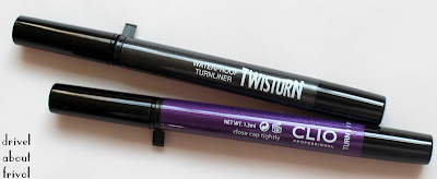
The Clio WP Brush tip is most similar to the latest incarnation of KATE Super Sharp (S) in shape, though marginally pointier and with a longer length closer to that of La Rose de Versailles' Oscar liner. There isn't really much to choose from between the four Japan-formulated pens on the right -- clearly I have very specific brush liner tastes. (I hasten to add that the other three are all ones I've finished and kept around for blog pic purposes.) The Clio Twisturn brush is noticeably thicker and softer -- of which more below in #3.


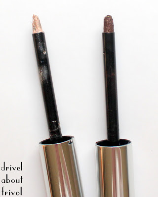
3. Waterproof Twisturn Liner 6 Night Purple and 7 Club Black
As shown in the comparison pic above, these sparkly liquid liners come with a thicker, loftier and softer brush than your average plain black pen liner, and the formula is also runnier, a light liquid that borders on gel. Unlike the automatic Brush Liner or Eye Guard Liner, you twist the bottom of these pens to dispense the amount of pigment required -- one click for a delicate wash with sparse shimmer; two or three for an opaque glitter-packed line in a darker, richer version of the colour. These do layer excellently, over themselves or other gel/liquid liners laid down as base, so building up to a graphic wing doesn't result in flaking or balling up; it just takes a bit more time. Personally, I find the combination of high-slip formula and bendy brush a bit overwhelming on my small eyes, and tend to reach for a more precise brush to pick up product from the clicked-up blob, dab off any excess on the back of my hand, and apply separately.

Single line swatches:

Three layers:

Even when built up, Night Purple has more of a pearlised finish with pink and blue microshimmer, while Club Black is darkest gunmetal with silver glitter of various sizes and a finer rainbow of microshimmer scattered through. Of the two, I prefer Club Black -- its base is texturally lighter and so doesn't set to the more solid-looking film of Night Purple, and scattered sparkle tends to be more flattering on my skin. Both however, are tubing liners, which means they form a film as they set and remove (with cleansing oil) in little clumps or balls like the waterproof glitter liquid liners from Stila, MUFE etc.

Comparison swatches
Night Purple with Kiko Super Colour Eyeliner in 110 Pearly Regal Purple, Pixi Black Tulip and THREE Eye Belong.

Club Black with THREE Eye Rock, Clio Gelspresso Liner Golden Black (see below #4) and RBR Long-Lasting Pencil Calypso.

Overall, the Twisturn liners are very similar to the Japanese cult favourite Majolica Majorca Perfect Automatic Liners, but are made in Korea. Ingredients.


4. Gelspresso Waterproof Pencil Gel Liner 3 Golden Khaki and 7 Golden Black
This was the one Clio product I had heard of before Peach and Lily wrote to me, shimmery gel pencils famed for bold pigment and lasting power even on the oiliest hooded lids in humid East Asian summers. My lids produce zero oil :( but while not the creamiest these have enough slip not to drag, and since arriving in Hong Kong I can testify that they remain pristine through a drenching by tropical rainstorm and some aggressive sleep-deprived watery-eye-rubbing.
Each twist-up pencil includes a sharpener in the base -- helpfully, because while not as buttery as the Pixi or THREE liners I adore, these are after all gels and do blunt quickly, so if you want a very neat-edged shape, you'll have to sharpen the tip often, use a separate brush, or prepare to clean up. Or, of course, you can go with the grunginess of a blunt tip and scribble these on before blending/smoking out with a pencil brush. On my dry lids, I get about 10 seconds of blending time before the unbudgeable setting; most people will have a bit longer to work with -- from what I've read, around 30 seconds seems average and should suffice for a great smokey eye.

One stroke swatches on top, built-up scribbles below -- there isn't too much difference in either precision or opacity. I particularly like that both these shades marry a cooler, ashier base with neutral-to-warm gold shimmer -- it makes for balanced, versatile colours that complement a wide range of shadows.

Comparison swatches
Golden Khaki with Kiko Super Colour Eye Liner 113 Olive Green and THREE Eye Doll.

See above in section #3 for Golden Black comparisons.

I found these most comparable to the Rouge Bunny Rouge twist-up Long-Lasting Eye Pencils, which I also like very much. Formulated in Italy, made in China. Ingredients.


5. Friday Glow Liquid Eyeshadow 2 Sheer Beige and 5 Deepen Brown
I adore non-powder formulas but am consequently extremely picky about them; my record with liquid eyeshadows has been rocky -- Rouge Bunny Rouge's elegant demi-matte neutrals are staples, but various formula niggles prevent me from truly loving those from Ellis Faas, Paul&Joe and Addiction. These Clio Friday Glow Liquid Eyeshadows have made the utter love list. Ridiculously silkily blendable with that dry silicone slip, wearable as a gossamer veil or easily layered to make a opaque washes packed with multi-toned, multi-sized sparkle, these dimensional neutrals have stayed in my weekly rotation for months.

Topped with dense but soft pencil brushes (around the dimensions of the No 7 Smokey Eye Brush of Lisa Eldridge fame) rather than the more usual sponge tip or synthetic flat brush, it's actually feasible for me to both apply and blend these straight from the tube in a pinch, though a separate blending brush does yield smoother results. Initially dispensing as an unusual 'dry liquid' much like the RBR creams, these set to a very elegant lightweight creamy-powder finish undetectable on the lids, and remains blendable, so you can take your time and make a range of shapes, much like any good powder shadow.
In complexity of sparkle, ease of use, lasting power, and zero fallout, they rival the Sonia Rykiel mousse eyeshadows which are some of the most dazzling I've ever encountered.

Straight-from-the-tube swatches: 

Comparison swatches:
Sheer Beige with the peach from Suqqu 01 Kakitsubata, the peach from Visee x Smacky Glam BR-7 Bitter Brown, Sonia Rykiel Mousse Eyeshadow 05, beige side from Paul&Joe Eye Gloss Duo 05 Bourgeoisie, Chanel Illusion D'Ombre Convoitise, RBR Sleeping Underneath a Mandarin Tree pigment, gold from Suqqu 06 Ginbudou, Fyrinnae Nijiro.

Close-up with fuzz of Clio Sheer Beige, Sonia Rykiel 05, Paul&Joe Bourgeoisie and Chanel Convoitise -- this gives a truer idea of the complexity of texture irl.


Deepen Brown with the darker side of P&J Eye Gloss Duo in Bourgeoisie, Kiko Long-Lasting Stick Eyeshadow 04 Golden Chocolate, RBR Long-Lasting Eye Pencil Lola, darkest shade from Visee x Smacky Glam BR-7 Bitter Brown.

Close-up of P&J Bourgeoisie, Clio Deepen Brown and Kiko Golden Chocolate (most texturally accurate):

Made in Germany. Ingredients.


6. Mascaras: Twistup Long Lash and Curling, O'Tank Volume
I am even pickier about mascaras than I am about most other things, so let's get the positives out of the way first. Both of these formulas are true black, neither too wet nor too dry, unscented, are waterproof but not too crispy, and easily removed with cleansing oil, don't smudge or flake throughout the day, and the bristle brushes are of reasonable size, with a slight curve to fit around the eye and well designed, so that you don't end up with globs of formula or have to resort to scraping out the inside of the tube to try and get something onto the brush.

Brush comparisons
Maybelline Rocket Volum'Express WP, Fasio Full Dynamic Volume, Clio O'Tank Volume, Clio Twistup Long Lash and Curling, Majolica Majorca Lash Expander Edge Meister.

Now for the dealbreakers. Twistup Long Lash is a very thin, dry, fibre formula, which adds length but no volume. For my reasonably long but very thin lashes, that just results in anemic splindliness. Those with straight but naturally thicker lashes might find this a good everyday no-mascara mascara; the brush is dainty and fits wonderfully around every contour and would work as a lower-lash brush too. If only it was fibre-free, this would've made a good replacement for my discontinued HG defining mascara, Shu Mascara Basic.
fibresssss


The O'Tank Volume dealbreaker is simply that it wilts my curl. This is a scant five minute after application:
O'Tank's thicker bristles and formula can also make it start to clump after a few strokes (as you can spot on my outer lower lashline); it leaves lashes soft enough that the clumps are easily brushed through, but I am too lazy to bother doing that with a lacklustre formula.

Both mascaras are made in Korea. Twistup ingredients.O'Tank ingredients.


In conclusion (pause for gusty sighs of relief from the two people still reading), this is the first Korean brand with this impressive a hit-rate for me. The standouts for me are the Eye Guard Liquid Liner (#1) and Friday Glow Liquid Eyeshadows (#5) but I would also heartily recommend the Waterproof Brush Liner (#2) and Gelspresso Liners (#4), especially to those who tend to experience smudging with eyeliners. Twisturn Liners (#3) are worth a try if you're after easy-to-use sparkly liquids and dislike felt-tip applicators, but for me Kiko Super Colour are still the winners.
Both mascaras were fails for me, but if your lash issues are opposite to mine (i.e. thick, shorter lashes) and have small eyes Twistup Long Lash, with its delicate lengthening waterproof formula and dainty brush, might prove a winner. O'Tank would be a decent volumising formula for the naturally curly-lashed, but isn't so exceptional that it's worth going out of your way to track down.

CLIO Reviewathon Part II: Looks

$
0
0
See Part I for the reviews proper, swatches and comparisons of my Peach and Lily Clio haul.

Apologies for the delay in getting this post together -- my laptop and I were caught in a tropical thunderstorm shortly after arriving in Hong Kong and I lost all my to-be-uploaded pictures. :'( So there will be some seriously scrappy pics and floating eyes without face context, but on the plus side, your scrolling fingers will be at less risk of developing tendonitis.

Anyway, these looks using my Clio goodies are all more or less slavish imitations of Jung Saem Mool's, Korean makeup artist to da starz, and doyenne of modern, neutral looks with many a clever twist of shaping or textural combination, to enhance a wider variety of eyeshapes than the textbook 'average' eye commonly found in English-language makeup teaching (or the one, usually exceptionally flat and monolidded type, which is thrown in to represent ALL 'Asian' eyes). Okay, soapboxing aside, she employs lots of interesting liner shapes, which makes for the perfect pairing with Clio, known especially for its liners. Though I miss the wackier Engrish of her older, no-longer online vids.


1. Widened Eyes
This is a great, targeted video which offers a very simple way to widen close-set eyes, which I also have, though otherwise my eyeshape differs quite a bit from her model's :) 

My skin prefers grey to brown as a neutral, so instead of the brown powder shadow she used to shade the model's liner, I smoked out the edges of my Gelspresso Golden Black pencil line for a coal-with-warm-shimmer instead. My lower lashline neutral sparkle is Friday Glow Liquid Eyeshadow Sheer Beige, with Twistup Long Lash for a nothingy mascara, 

Lip and cheek inspiration comes from this video's cutesy cool pinks, and centered, rounded blush placement (note that it also features this widened eyeshape, an ongoing trend in K-makeup). I used Etude House Fresh Cherry Lip Tint 2 Pink topped with RBR Kiss Elixir lip balm, and Miss Tangerine Choux Cream Blusher #3 Miss Berry.


2. Extended Eye
Wait, didn't you just do this? I hear you ask. :D Such is the subtlety of JSM's variations. This look also extends the liner past the eye, but angled slightly up, and instead of joining with the lower lashline at the outer edge to place emphasis on that corner, it's mirrored by a lighter lower lashline wing. This all works to lengthen the eye again, but also to widen it vertically (open it up), though with all this stuff going on at the outer corner, and both lines tapering as we move inwards, this look also makes the eyes seem wider-set.

I did a slightly more kicky-neutral version, with Gelspresso Golden Khaki pencil on the upper lashline and Friday Glow Liquid Eyeshadow Deepen Brown on the lower. Er... and then I added a wash of Friday Glow in Sheer Beige all over the lid, because SPARKLY. The way my eye curves means it looks sparkliest over the centre of my eye, so it adds to the vertically 'opened out' look. Ahem, totally intentional and planned and stuff.
natural light
bathroom light to capture SPARKLE


3. Gradation Technique
This combines a vertical gradation (i.e. a smokey eye, fading out from a darkened lashline) with horizontal shading at both inner and outer thirds (sometimes called a 'tulip' placement) to open the eye up both upwards and outwards, while adding dimension and depth. This is the kind of thing to throw at people who claim that black rimming the waterline always closes up the eye, or makes 'Asian' eyes looks smaller; there's a reason smokey eyes (not necessarily using the classic 'smokey eye' colours) are actually the ones you see most often in Asian magazines and ads. Because it's so balanced, this look would suit most, though if your eyes are very close-set (or you want to make them look as wide-set as possible) you might want to skip the darkened inner corner; very prominent or bulging eyes may want to skip the central highlight.

I used all creams to create this look, as the Clio textures are so blendable they layer and blend much like great powder shadows anyway: both Friday Glow liquids to create the 'tulip', WP brush liner on the upper lashline, smoked out with Gelspresso Golden Black pencil, and the versatile Eye Guard liner on the waterline. Volumising

Popsicle lip with Etude House Cherry Lip Tint 1 Red, inspiration courtesy of this vid (which features a similar combination of vertical and horizontal gradations, although with the horizontal one going more traditionally from lightest at the inner corner to darkest at the outer):


I lost a few other JSM-inspired looks in the great hard-drive flood, but there will be more in future posts I'm sure! (And in past ones -- she's a big influence on me, as you can probably tell.) Do you have a particular favourite video, look, or technique of hers? 

In the meantime, here are two winged liner looks which aren't particularly JSM-ish, but which show how well the Clio Twisturn liquids layer and build:
Club Black sandwiching Night Purple in natural light
and vice versa, in bathroom lighting -- bottom of the barrel pics, okay?

Addiction x Jean-Michel Basquiat Soda Lunch

$
0
0
Every season there seems to be one particular collection that just nails the zeitgeist and pulls me back in to this makeup hobby. Since its 2009 launch, Kosé Addiction has consistently remained one of the ones to watch for innovative textures, colours and stories every season, and I declare their release of six eyeshadow quads in Basquiat cases the collection of summer 2013.

My pick from the six was the limited edition Soda Lunch, which features the most unusual colour-combo and the coolest case in makeup history. Don't even try to contradict me. Your argument is invalid because DINOSAUR.

And many of my very favourite bloggers agree. For in-the-field swatches of all six quads (four to become permanent in plain cases, two limited edition), see my darling So Lonely in Gorgeous' pair of posts. For more dinophilia in particular, see and squee: Swatcharama!Wondegondigo and Rouge Deluxe.

My pictures will just supplement theirs, because moar pron = moar better, always, amirite?

I think you can tell from the pans alone that these are from the silky and tightly packed school of Japanese eyeshadow, with the white softest/creamiest and the yellow driest/firmest; this makes perfect sense to me because the white will usually function as a wash/base, and the yellow as controlled accent, uses which the textures facilitate beautifully. Also, DUOCHROME PAHRPAL ZOMG. This totally makes up for my disappointment with Suqqu Sumiredama, which also featured a blurple duochrome.

Swatches
(Comparisons will follow once I'm back in London and have full access to my stuff.)
As usual, swatches are made with the included sponge applicators onto my bare arm -- two swipes for the the teal, one swipe for the other three shades.
natural light, indirect
full sun, deliberate fuzz
From left to right: 
turquoise satin base with sparse lime and periwinkle microshimmer
delicate rainbow sparkle that reads as an opalescent white rather than a metallic
primary yellow matte base with sparse silver and cool lemon microshimmer
purple metallic base with dense blue duochrome shimmer and sparse green and pink sparkle

While the blurple duochrome is the most attention-seeking shade, bless its pretty twinkly heart, the 'secret shimmer'* in the turquoise and yellow are for me the cleverest aspect of a very clever palette. With my unfortunate combination of garish-clown tastes and paper-thin, dry skin, I know through painful experience just how chalky and flat this kind of saturated bright can look sitting on top the skin, and yellows in particular tend to darken from promising lemoniness to muddy mustard; the secret shimmer in these shades barely registers as a satin finish, while keeping the tones true-to-pan, ensuring the kind of blendability more commonly found in metallics or frosts than mattes and retaining a pigmented translucency that melds beautifully with even my dry skin. In keeping with the playfulness of the colours and case, the overall effect is at once boldandlight -- graffiti.

*A trick that Sugarpill also employs -- if you look closely, you'll find a similar kind of secret shimmer lurking in their 'matte' brights -- but the finer milling, clearer bases and greater tonal complexity of these Addiction colours are more flattering on me; Sugarpill Burning Heart (with a warmer yellow and purple) is heading out to make room for Soda Lunch.

My first look with this quad uses all four shades, something I probably won't do that often in future. A bit scrappy, and built mostly around the rainbow white as negative space, because I wanted something graphic but not too precise or heavy. Also, no foundation because melting. But hey, I had fun :D

Concealer: Burberry Sheer 01
Mascara: Majolica Majorca Lash Expander Edge Meister
Brows: SUQQU Brow Pen 01 Moss Green
Blush: Shu Uemura Sakura (LE, summer 2006)
Lip: Fresh Sugar Rosé

Chanel Illusion D'Ombre Convoitise (and others)

$
0
0
Way back in Easter, I received a glorious surprise parcel from a European makeup fairy, and it included (along with far, far more treats than I deserve) the then-new-and-European-exclusive shade of Convoitise to join my Chanel Illusion D'Ombre family.

I have never been and am not a Chanel girl, finding the skincare ridiculous and most of the makeup lacklustre, but the Illusions D'Ombre have remained my favourite cream eyeshadows since release and they cannot be said to lack lustre in any sense :D Glitterfest:
natural light
full afternoon sun
artificial light with flash
For any eagle-eyed, link-clicky pedants being all, "Hey... if Mirifique was your favourite, where is it now?" -- in short, sod's law, it dried out [Illusoire and Épatant, which I also bought on initial release, are still going strong], I flooded it with an excess of glycerin trying to revive it, and thoroughly ruined it. If anyone's rescued theirs, I'd love to hear how. In the meantime, I'm re-tightening lids like a maniac and storing upside down, as with all cream products.

These aren't exactly my usual obscure beauty blogfare, so I'll skip the usual epic ramble on texture etc. But I hope you can pick up from my swatches that, with the first four establishing the 'standard' Illusion D'Ombre finish, Vision sits on the chunky-irregular-glitter [actually, it kind of sucks, but it was a Christmas present and works okay as topcoat over a sticky base] and Convoitise on the delicate-microshimmer sides. Both of these have tonal sparkle, rather than the multicoloured glitters of the other four -- Vision shifting from warm to warmer, and Convoitise from neutral to cool.

But throughout its shifts, Convoitise retains an unusual creamy aspect (the colour, not the texture/finish). Probably most accurately described as 'gold', it isn't metallic at all -- more of a soft sunlight-through-peach-skin auroral haze thing. Perfect paired with pastels.

1. Florals...for spring? :P
Convoitise on centre of lid, Catrice Mint of Change in inner third and Art Deco 297 in the outer, with a mix of Art Deco 267 and 285 on the lower lashline. GOSH White eye kohl and Majolica Majorca Lash Expander Edge Meister mascara.

All these new German products accompanied Convoitise in the same fairy parcel, along with Addiction Damask Rose cheekstick, worn here on lips and cheeks.
me trying to look suitably demure and landing somewhere past 'prim' into 'constipated'


2. Er... Spring into summer? Mix'n'match? Well, they can't all have a theme.
An elongated shape this time with Convoitise over the lid and lower lashline, Art Deco 285 by itself to shade edge, and the last of my RBR Long-Lasting Pencil in Lola to line. Fasio Full Dynamic Volume BR300 mascara to complete the colour palette (similar to the look from my original mascara review).

As you'll have gathered by now, so much pretty-prettiness on eyes impels me to reach for a bright lip: Addiction Le Mépris Lip Crayon is currently my most eye-searing shade (applied in a far more precise way than usual, in kind of a '20s shape) and because if you're going to clash, you may as well kerlash, bright pink cheeks courtesy of Dolce&Gabbana Provocative.


As with most of my enduring loves, I wear my Illusions D'Ombre far more often than I think to drivel about them, but you can find some looks with Eblouihere, with Rivière (LE, which I've since ditched) here, and Abstractionhere.

Mascara Colours: RMK Separate Curl Mascara N EX-01 Red

$
0
0
Even without the stimulus of a Chanel's L'Été Papillion collection, coloured mascaras are something I always flutter towards (and, er...with) come summer. Last year, a pair of YSL Singulier Nuit Blanche (i.e. waterproof) shades saw me through: 04 Vibrant Violet (which I actually forgot to write about, but that may be remedied as I've repurchased it this year) and 05 Vibrant Blue, shown here -- the effort:impact ratio is the most obvious asset of colourful mascaras in summer heat.

Navies and plums are fairly common as far as mascara colours go, but don't quite hit my garish clown sweet spot; conversely I've been disappointed in the formula of all the brights I've tried from Barry M, LA Splash, Stargazer and even my beloved Kiko (lash-wilting, clumpy, unevenly pigmented messes, all). Enter RMK Separate Curl Mascara N in EX-01 Red -- truly as lash-defining, curl-holding and RED as its name promises:

The shade is a bright, clear, pink-toned red with no muddy brown notes or tiring warm plumminess; the wand a no-fuss straight tapered bristle brush, a little smaller than average; and the formula an excellent Japanese waterproof offering, without fibres! which, if not quite as feathery as Fasio Full Dynamic Volume, still eclipses most at providing separated flutteriness. The formula is wet enough for several passes through my lashes without clumping or glooping, but it still sets to the expected Japanese-apocalypse-proof standards without excessive crunchiness -- it's certainly not so dry that it flakes (as the YSL Singuliere formula tends to, mildly, after a few weeks) which is a very good thing with a colour this vibrant. Pigmentation is great: this is designed for black lashes, after all, and I don't need any kind of primer underneath to get true-to-wand lashes.

one coat of RMK Separate Curl Mascara N EX-01 on lashes curled with Chanel curler
Okay, in ultra close-up it looks a bit scrappy, but we're after easy summer impact, not fifteen minutes of wiggling the wand right into the base of every lash and then cleaning up....
The no-fibres formula means this will work for lower lashes even if, like me, you HATE spindly lower lashes. I chose to keep the reds on the lower lash tips only, as taking it right up to the lower waterline is a bit too unforgivingly rabbity, even for this clown.

Rest of face kept very simple -- if not quite my strictly wanktastic definition of minimal ;D -- a barely-there eye with the white from Suqqu 09 Koju quad as wash/highlight, Rouge Bunny Rouge Sweet Dust Seriema to shade socket and lower lashline, and a little Addiction Lady of the Lake eyeliner smudged into the upper lashline.
Suqqu Creamy Glow 18 Karakurenai on lips (made glossier and warmer with a little RBR Kiss Elixir balm) and a very light application of Dolce&Gabbana Nude blush. I knocked all the redness out of my face with a heavier-than-usual application of Shu Uemura Pink/Purple UV mousse and Koh Gen Do Maifanshi Moisture Foundation 001, with Shiseido High Beam White through the centre of the face.

Brows and undereye concealers the usual Suqqu Moss Green, Burberry 01 and Tarte Maracuja Fair.

RMK Separate Curl Mascara N is made in Japan and also comes in three permanent shades of black, brown and blue (EX-01 Red is limited edition). Ingredients here.

Madame Flirte

$
0
0
A first-impressions look at Guerlain Rouge G Madame Flirte, one of three limited edition lipsticks in their autumn 2013 Violette de Madame collection.

Packaging is the usual space tampon holder of doom, limited edition denoted by the fishnetty polkadotty print, which I actually think (despite being a constant lover of both fishnets and polkadots, regardless of trends) looks fairly cheap and not in a good way....
Good thing, then, that the shade displays in full Guerlain lip products' usual exquisite colour-balance and complexity -- a strawberry red perfectly pitched between soft and bright, in a glossy jelly finish with the faintest hint of multitonal microshimmer.

I'm guessing that shade description will have some of you blinking, but seriously, this Rouge G bears very little resemblance to such pigmented beauties as GirlyGilda or Gigolo; it's in fact sheerer than all the core Rouge Automatique shades, and while more shimmery than Liu or Chamade in that range, looks decidedly unsparkly next to Coque D'Or or L'Heure Bleu.

Comparison with Rouge Automatique Liu to show relative opacities (crelly Liu vs. jelly Flirte) and tone (bright pink-red Liu vs. softer, warmer strawberry Flirte):
full sun
indirect light

The shimmer in Madame Flirte is so subtle, especially upon layering, even a total lip-shimmer-phobe (i.e. me) will admit it rounds down to invisible once on the lips.

In full sun, angled and unfocussed to try to capture some of the glimmer:

Lip swatch, 2 layers, applied straight from the bullet, also in full sun:

Face context, with Maquillage True Eyeshadow RS721 and Canmake CL04 blush.


I suspect wear-time will be most people's complaint about Mme Flirte; for me, touching up such a gloriously moisturising, balmy formula isn't a big deal, especially in such an easy, summery shade. In any case, it wears down (evenly) into a very pretty glossy-stain rendition of itself after a meal:
with flash

Finally, upon request, some counter swatches of Madame Flirte with her sisters, Mesdames Batifole and Fascine (two swipes each):

Madame Batifole is by far the most pigmented of this trio, but it looks sheer next to a really pigmented Rouge G like Gigolo, and comes closer in opacity to a pigmented Rouge Automatique like Guet-Apens:

Madame Fascine is a cool pink that makes Rouge G in Girly and Rouge Automatique Bloom of Rose look positively corally, but it's warmer and softer than the really cool Rouge Autos in Shalimar or Champs Elysées, and sheerer than all of these.

Madame Flirte's soft-but-bright tone made me swatch it against the closest coral and closet pink-red in both Rouge G and Rouge Auto lines: it's softer and cooler than Gala, clearer and cooler than Gracy, but softer and warmer than Rouge D'Enfer. The closest analogue is Coque D'Or, with more pink and far less gold shimmer -- Flirte's microshimmer is finer, more sparse, and cooler-toned.

Further Flirtations (Previews and a Poll)

$
0
0
Hello! I should be back to a more regular posting schedule now -- thanks for your patience and forbearance and other such biblical ences, and especially a big thank you to all those who emailed me during this time to share best wishes and sweet nothings, and the occasional picture of cake.

Being without a blog-dictated schedule of stuff to review and therefore wear has meant that I've been able to focus on using and even using up certain items, and working out which products I don't reach for as often as I would like to -- in my new, extra peripatetic life, love isn't enough to earn something a place in my collection any more. So expect a new BLOGSALE to go up some time tomorrow evening (GMT) -- my lovely belly (...that came out wrong) has just posted various wise and witty things about her purging process, so I'll just say "samesies!" and leave it at that.
Some of the things going under the hammer:


Actual posts coming up shortly:
1. Stuff what I've (nearly) finished


2. New stuff to replace them!
MOAR Givenchy Le Rouges
Korean brand Innisfree 
THREE's spring/summer collection was my favourite of the season

3. Jellython! Including some stellar new (or at least new-to-me/blog) Japanese formulas

4. Autumnnal anticipations from Biteki Sept 2013


5. Brushes by Brand -- a new series of review posts (I'm often asked to list my favourite brushes from brand X, so hopefully this way of organising them will be heplful).


Any of these pique your interest? Further requests may as always be emailed to drivelaboutfrivol at gmail dot com.


Finally, a poll:
Some of you will know I've been dabbling with sewing/dressmaking since December last year. Since then it's inched out makeup as my primary hobby -- i.e. instead of drifting off dreaming up eyeshadow placements, I'm matching up fabrics and linings and trims with patterns. 
Little Black Dress pattern from July So-En magazine | Leicen printed cotton and organic black solid cotton/linen blend
As yet orphaned fabrics, all acquired during my recent Asian travels:


Latest finished object: Sewaholic Pendrell in a filmy cotton voile bought in Hong Kong's Western Market.

Now that the pretties I whip up no longer unravel as soon as you look at them sideways [a key revelation: dispense with whip], I naturally want to geek about them! Unlike the occasional clothes posts I've done before, these will be more detailed about the construction process, and probably involve pattern/book reviews, random blatherings about new techniques etc. but won't occur more than once a week at most.

So should I:
A) keep everything on drivelaboutfrivol.
Ai) keep everything on drivelaboutfrivol but put things behind jump cuts so you can chose whether to read individual posts in full.
B) make a separate blog for this, and shove the knitting and occasional clothes posts there too.
C) other -- what?
D) caaaaaaaake! 

Leave me a comment or drop me an email. Don't be shy -- if you don't weigh in now, you waive the right to grouse later ;)


PS While we're at it, for those who liked book posts, I'm now on goodreads. Always up for chatter about stories, so poke me if you're there too.

BLOGSALE

$
0
0
Here!

Also, caaaaake.
Being my very favourite lemon cake, crumbly-dense with syrup but still fluffy, lightly spiked with thyme, courtesy of Nigel Slater. Recipe [edited to add actual recipe, derp]
Also delicious if you substitute for the thyme basil, rosemary, lavender, or sage. Lemon thyme is nice too, but up the quantity a bit.
Tarts up beautifully with a dollop of Greek yoghurt and scattered ripe raspberries and/or edible flowers, but I like a plain slice with a cuppa best.

Jelly Season: Chicca Flush Blush 01 and 09

$
0
0
Let's kick off the Jellython with Chicca (pronounce 'kicka', remember, as mentioned in my original review, which includes details of finish, texture and what I've found to be the best application tools) -- namely, two more of their delicious translucent solid gel Flush Blushes, in shades 01 Baby Girl and 09 Feels Love? Fields Love? (Katakana is ambiguous.)

En famille:
01 Baby Girl is a light, Bardot-ish beige brightened by both pink and yellow tones.
09 Fields/Feels Love is an unapologetically pretty watermelon pink.
10 Girly Blush (originally reviewed) is a fairytale clear pink-red.

As before, I purchased the refills only, for ¥3150 each. They fit neatly into a Yaby freestyle palette (heftier and more airtight than the Z palettes I favour for powder depots), along with my Kjaer Weis Lovely cream blush refill, which you can see is of a more conventionally creamy texture and lacks that 'jelly' glow the Chicca shades display, even in the pan.
this picture is truer-to-tone than the one above, on my screen at least

Swatches of the newbies, heavy stripe made with a weasel hair lip brush and (probably over-) blended one with a damp beautyblender:

What I love about both these shades is their uniqueness of tone. They're not obviously 'zomg undupeable!!!' (I hate that term) in the way a glittery lime-green blush might be, but within their respective highly-wearable genres they are very well balanced, quietly complex, and are possessed of both depth and glow (yes, again, sorry).


Comparisons illustrate this best. Just as 10 Girly Flush nestled perfectly in between my various reds and pinks, 01 Baby Girl performs the same magical balancing act among my 'nudes':
Addiction Day Trip (sheer) lipstick
Ladurée Cream Cheek Base 102
Chicca 01 Baby Girl
Dolce&Gabbana Nude
Rouge Bunny Rouge Delicata
Shu Uemura M 521
While just as pale as Ladurée 102 [review], 01 Baby Girl is clearer and so sits more harmoniously on my skin, working as a genuine nude rather than a pop pastel. While looking distinctly peachy next to 102, its pink tones come through in comparison with D&G Nude, RBR Delicata or Shu Uemura M 521. Blended with a clear yellow rather than D&G peach-brown and RBR's yellow-brown notes, Baby Girl shares a softness with the first two shades, less obvious in M 521; despite that, its texture still means it glows brighter on the skin than the tonally-brighter Shu matte.
Of all these blushes, Baby Girl harmonises best with my most flattering 'nude' lipstick: Addiction Day Trip, and will replace all but Delicata (which I expect to use up this year anyway).

Look
Chicca 01 Baby Girl (applied on apples, blended up and out along cheekbone) and Addiction Day Trip on lips, both looking pinker than in the swatch pic because of my naturally cool pink lips and cheeks. Foundationless skin, onto which these blushes meld beautifuly! 
Eyes: grey cream (Batiste Grayling) as a wash, overlaid with dark gold in the centre of the lid (Bohemian Waxwing mixed with Angelic Cockatiels) and sparkling black (automatic pencil in Calypso) smudged along lashline and outer v, blended with a delicate pewter pigment (Night Wing Sailing). All products Rouge Bunny Rouge. Hey, such effortless lips and cheeks mean I have too much more time to play with eye makeup.


Onto the watermelon pinks!
Becca beach tint Guava
Becca creme blush Hyacinth (discontinued)
Chicca 09 Feels/Fields Love
RMS Beauty lip2cheek Modest
Bite Beauty High-Pigment Matte Pencil Tart 
Canmake cream cheek CL03 Clear Sunset
Again, even if I hadn't mean to centre the Chicca shade, it would end up in the middle if swatched by depth, warmth or colour alongside my similar shades. (How do they manage it?! I feel...watched.) Closest in colour is Becca Hyacinth, though Chicca is even more rosily-corally complex (and Becca are justly known for (and now cursed for discontinuing) their excellent cream blush range), 09 wins out for its scentlessness and texturally invisible, lit-from-within 'jelly' glow vs. Becca's merely creamy cream (no hyphenation needed). Also gone, Bite Tart lip crayon tips the scale further still into pink/red territory, while 09 is perfectly indistinguishably balanced between rose and coral.
Items which I'll be keeping (for now): Guava beach tint, significantly paler than Chicca, and RMS Modest and Canmake CL03 which are substantially darker and warmer on the cheeks.

Look
This time, I used Innisfree CC cream as a base and applied 09 Feels/Fields Love in a more rounded shape towards the centre of the face.
Lips: Maquillage True Rouge RD382 (details coming in a future jellython!)
Eyes: Suqqu 06 Ginbudou quad (purple to line upper and grey to line lower lashlines, gold blended up to socket), overlaid by the peach from 07 Komorebi on the lid.


Both looks: Suqqu Brow Pen 02 Brown in brows, Burberry Sheer Concealer 01 as undereye concealer, Shu Uemura Nobara 784 as blemish concealer, Majolica Majorca Lash Expander Edge Meister mascara.

Next Season... Autumnal Anticipations from Biteki Sept 2013

$
0
0
My spring/summer review pile is giving me major stink-eye (yes, it's so large and has been piled up so long it has now attained sentience), but la la la let's look forward to the next season's pretties anyway! 

As always, the September issues of the big three Japanese beauty mags (Voce, Maquia, and Biteki) each include a collections booklet, detailing the upcoming releases in exhaustive detail; my choice this year was Biteki, as its freebie appealed most -- a deluxe sample of the bestselling, very highly rated on @cosme Motemascara from Little Witch.

Purchased from JP-Books, which after the closure of Mitsukoshi Regent St. is due to move to its own standalone shop on Denman Street shortly (conveniently located next to the delicious Shoryu ramen shop). The old points card will still be valid (yes, I asked...maybe a bit too anxiously, to the vast amusement of both cashiers).


As I've used up / cleared out / sold on so many products over the past few months, I've built up quite a bank of 'outs' to spend on new 'ins' to fill in the gaps that have emerged in my collection. It's become clear that most of the products I'm happiest with texturally (which is by far the most important factor deciding a product's longevity in my stash) are made in Japan, and this season has several promising releases, including shades I've struggled to find in Japanese brands in the past.

Sonia Rykiel is one of my favourite made-in-Japan makeup brands, and I'm very excited for their quartet of cream blushes (right page, left side) -- long time readers may know that I have an ongoing goal of replacing all my powder blushes with creams and 04 may be the pink-toned neutral to displace my beloved RBR Gracilis. Intriguingly, they'll be supplemented by a trio of gel blushes (left page, right side) -- I wonder how these textures will differ? The stripy powder blushes look similar to the SR blushes I've played with in the past i.e. frosty and sheer, so my heart doesn't flutter. A huge fan of the SR jelly lipsticks, I'll be curious to see how these new mattes perform.


Addiction continues to be the exciting, texturally innovative brand we're all so hooked on, with seven shades of shimmer-free liquid blush (bottom left) to anticipate. Womanfully resisting another rendition of my adored Revenge, I am however very tempted by Suspicious (the cheekstick proving too dry for me). As Addiction's Psychadelic and Miss You More are two of only three lipglosses that I've kept, I may yet cave in to one of these new shades (top left): perky Garland or vampy Raisin or Crimson maybe?

The main mag had a ridiculously pretty look with the orange liquid blush shade, Fresh:


More blushes -- powders this time. Part of Visée's complete revamp, these powders include what look like an excellent range of contour shades. The bottom stripes in PK-5 or OR-6 seem very pasty-person-friendly, especially if these are sheer in the manner of most Japanese drugstore offerings; swirled together, you have the option of brighter or more muted colours, as well as controlling the proportion of each main shade.

The rest of Visée's relaunch:

Another drugstore brand which recently relaunched, Lavshuca expands its lineup with eyeshadow palettes which bear striking similarities to the luxe Ladurée offerings, and ombre blushes which recall several Estée Lauder group ones (from MAC, EL etc.) The new Candy Bonbon lipsticks will come in a more pigmented 'colour' finish (top left), balmy/jelly? 'clear' line (middle left), and a shimmery 'shiny' line (right), but I wonder if any will match up to the (discontinued) Dramatic Memory Rouge RD-1 I so love from them. So far, Lavshuca's 'new' offerings have been style over substance, but Japanese brands change so quickly I won't be writing these off until I can try them in person.


That's also my mantra when it comes to Lunasol -- it's impossible to tell season-to-season whether their latest eyeshadow palettes will be gritty dandruff shedders or silky complex deliciousness but I do like the sumptuous colour story, especially quad 01. Also appealing, lipstick 18 and liquid lipstick 24 -- both lip formulas I know to be reliably excellent.

Changes are also afoot at Suqqu with another new kind of quint and the by now usual limited edition embossed face palette. Rouge Deluxe has linked to several early swatch posts, and I'm hoping that these cooler, clearer ones prove truest to life. Irritatingly, the one which most appeals to me (EX-15) also seems exceptionally close to Hisuidama from spring/summer, so I'm pinning my hopes on EX-17.

Here's a showcase from the main mag, with Creamy Glow Moist lipstick EX-13, quint EX-17, the face palette, and both nail polishes -- I'm totally stealing that mani idea, by the way.


One of the realisations of my stash-editing shenanigans has been that THREE is rivalling or even supplanting Suqqu as my fav'rite brand. You probably can't really tell this from the blog, because I'm just lazy like that (working on posts, honest!), but it's true nonetheless and one reason is that whereas many recent Suqqu releases have proved too monotextural for me, THREE's 4D eye palettes have kept to a consistent textural mix of dry, complex cream, satin shader, delicate shimmer, and sparkle topcoat. I'm earmarking 09 -- it looks like a richly velvety autumnal quad, with that killer warm pewtaupronze glitter! -- but would happily wear all three (har har).
Their discontinuation of the chubby lip crayons (before I even had a chance to review my gorgeous Ruby) inspired a bit of impotent fist-shaking, so I'm very glad two new shades will be on offer -- 02 looks right up my street, and I hope they haven't buggered up the formula in the meantime.


I will, however, be taking a break from my Chicca investigations, as their autumn collection seems to be a rehash of their core offerings without new flush blush shades -- dusty eyeshadows, jellied lips, all in shades I already own. This is however a brand whose USP is ultra-refinement of finish and texture, so unsurprisingly suffers in pictures <---- please remember that should I buy something and have to eat my words.


For more focused frivolity (the fashionable term now is 'wardrobe planning', I believe....), my Suqqu Koju quad (from spring 2009, far right) is on its last legs, so I'll be hunting for a warm grey replacement.


Among the possible contenders is this lilac-tinged Cosme Decorte AQMW quad (024), a great excuse to try a brand I've been eyeing for a while:

....although KATE's new quint (BK-1) may be a better (and much cheaper) bet -- I tend to prefer Kanebo shadow formulas to Kosé ones, and KATE also made my second-favourite grey palette (Deep Trap Eyes GY-1, discontinued) which is also showing substantial dips.


And in the category of I-need-another-one-like-I-need-a-hole-in-my-head-but-I-can't-resist-them, Paul&Joe are releasing liquid lipsticks! In several gorgeous brights :D The collection is called Fairytale, and also features goodie boxes of eye makeup, liquid liners, and more lipstick (and lipstick case) shades.


Shiseido are also expanding their liquid lipstick line with four new shades (in Japan, six in the US), and they all look gorgeous on The Makeup Blogette. Personally I'm hoping RD413 Sanguine works as well on me as Disco (worn on 'Wednesday' here), and that RD314 Deep Coral will prove a non-drying version of Perfect Rouge RD142 Sublime.

Sub-brand Maquillage's autumn collection came out before I left Hong Kong, and I will be reviewing both True Rouge RD382 (worn in the second look here) and True Eyeshadow palette RS721 (worn here), which will replace both pink/taupe quads I posted above in my empties picture, and ousts Suqqu Usumomokurumi too.


What are you looking forward to in the next beauty season? Rouge Deluxe, A Touch of Blusher and Makeup4All have further previews.
Viewing all 208 articles
Browse latest View live


<script src="https://jsc.adskeeper.com/r/s/rssing.com.1596347.js" async> </script>