In this episode of Pattern Recognition, Consumerist Drone Mark III No.38759870 (I've had an upgrade) displays two new shades of Givenchy Le Rouge... or are they? *shrieky violins*
![]()
![]()
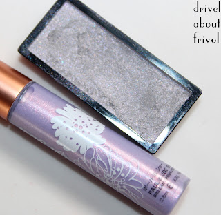
One swipe swatches straight from the bullet, because these are lovely pigmented knobs encased in leather... that sentence did not end where I'd expected it to. For more drivel about the (excellent) formula, see my original review of 201 Rose Taffetas.
Unlike 201 Rose Taffetas, these two shades aren't available everywhere -- 302 Hibiscus Exclusif I bought in Germany, 303 Corail Décolleté in the UK, so some international heisty shenanigans may be in order if you mean to acquire either.
302 Hibiscus Exclusif is a cool Barbie pink, my latest stab at conquering an irrational fear -- I mean, my bare lips are already corpsically blue enough, tyvm. To compound matters, this shade has a bit of that naturally-artificially-acid brightness of real pink hibiscus flowers, which in more prosaic terms means a white base -- something which can scupper even a bright shade for me (with clear brights, my clear, neutral skin lets me go as clownish as I please with pretty much any tone). [I'm talking opaque lip colours only here; eyeshadows are a whole 'nother kettle of fish I feel.]
So while not the worst kind of white-bright on me (er, that would be Shiseido Fuchsia *gags for lyfe*) I still felt extremely peculiar in Hibiscus Exflusif -- see how it 'sits on top of' my skin compared to my comfort-zone bright pinks? Lipstick Queen Bright Rose Sinner, By Terry Hot Cranberry, Guerlain Girly, Chanel Genial (dc).
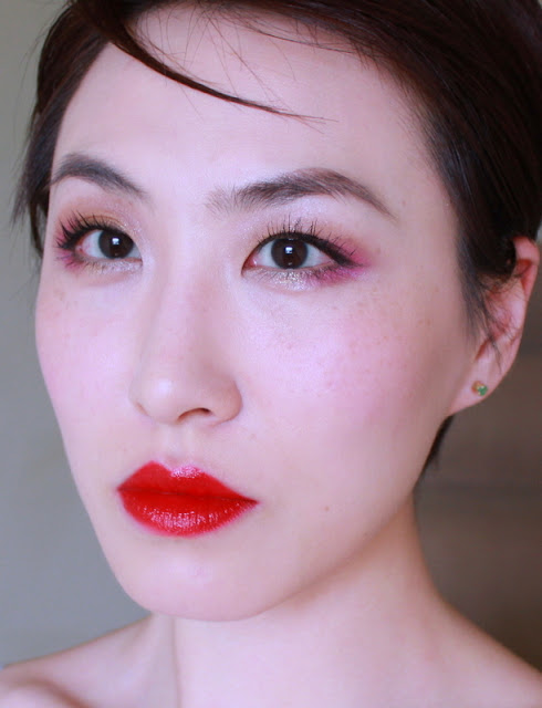
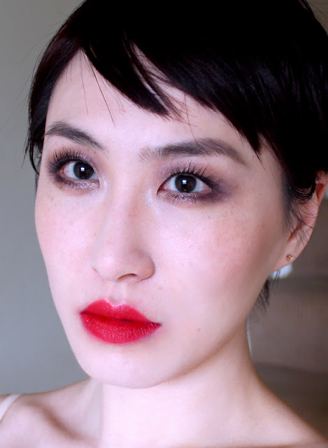
![]() Genial, which is the shade I was trying to replace when I bought this Givenchy number [I love it so much I've almost finished my second tube], is not only warmer and therefore more modern, but has that extra scintilla of brightness which makes it more of an all-out neon on me [look 2 here], which in turns renders the whole question of flattery a bit redundant.
Genial, which is the shade I was trying to replace when I bought this Givenchy number [I love it so much I've almost finished my second tube], is not only warmer and therefore more modern, but has that extra scintilla of brightness which makes it more of an all-out neon on me [look 2 here], which in turns renders the whole question of flattery a bit redundant.
So, as with every other cool pink lipstick ever, Hibiscus Exclusif is heading back out again. And the next time my brain thinks it wants to retry this experiment, I'm slapping it with a wet codfish.
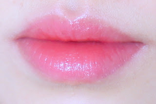
303 Corail Décolleté, on the other hand, is right up my street.
Seriously, Right. Up. My. Street.
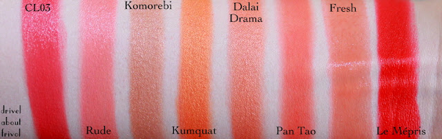
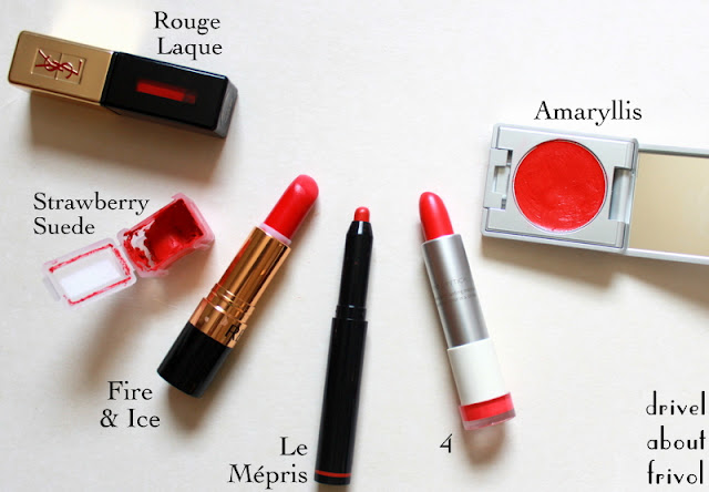
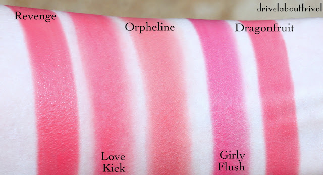
Revlon Fire&Ice and Strawberry Suede (dc); Lancome Corset, Addiction Revenge cheekstick, Chanel Genial (dc) again, Guerlain Colére.
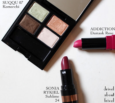
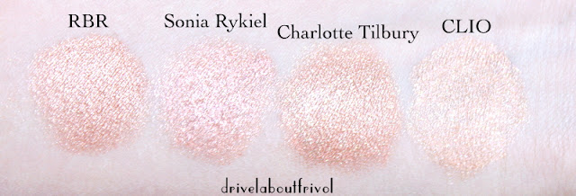
![]() To my shame, FOUR of them share a modern matte finish with Corail Décolleté: Strawberry Suede, Corset, Revenge and Colére and three are very similarly scented (Givenchy, Guerlain, Lancôme). In my defence, they do all look more different on my lips than on my arm (Colére is notably deeper and more red, Revengesofter and less pink, Corset rosier, Strawberry Suede more orange; the latter two formulas also suffer in comparison) but still. Clearly a genre I'm a wee bit obsessed with. I thought I was being so clever banning myself from all the reds in the Le Rouge line....oy.
To my shame, FOUR of them share a modern matte finish with Corail Décolleté: Strawberry Suede, Corset, Revenge and Colére and three are very similarly scented (Givenchy, Guerlain, Lancôme). In my defence, they do all look more different on my lips than on my arm (Colére is notably deeper and more red, Revengesofter and less pink, Corset rosier, Strawberry Suede more orange; the latter two formulas also suffer in comparison) but still. Clearly a genre I'm a wee bit obsessed with. I thought I was being so clever banning myself from all the reds in the Le Rouge line....oy.

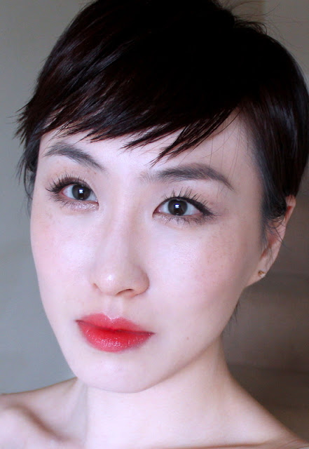
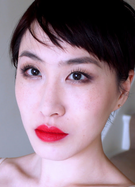
Left: 302 Hibiscus Exclusif | Right: 303 Corail Décolleté

One swipe swatches straight from the bullet, because these are lovely pigmented knobs encased in leather... that sentence did not end where I'd expected it to. For more drivel about the (excellent) formula, see my original review of 201 Rose Taffetas.
Unlike 201 Rose Taffetas, these two shades aren't available everywhere -- 302 Hibiscus Exclusif I bought in Germany, 303 Corail Décolleté in the UK, so some international heisty shenanigans may be in order if you mean to acquire either.
302 Hibiscus Exclusif is a cool Barbie pink, my latest stab at conquering an irrational fear -- I mean, my bare lips are already corpsically blue enough, tyvm. To compound matters, this shade has a bit of that naturally-artificially-acid brightness of real pink hibiscus flowers, which in more prosaic terms means a white base -- something which can scupper even a bright shade for me (with clear brights, my clear, neutral skin lets me go as clownish as I please with pretty much any tone). [I'm talking opaque lip colours only here; eyeshadows are a whole 'nother kettle of fish I feel.]
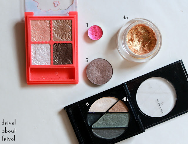
 |
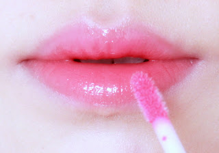
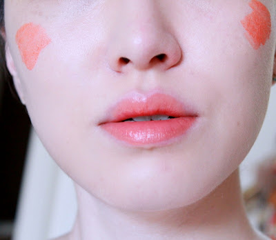
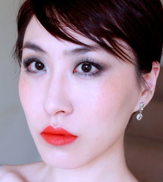
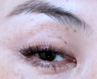
| eyes: Kiko 33 Smoky Grey eyeshadow stick, Paul&Joe eye gloss duo Nice, RBR Bohemian Waxwing cheeks: Canmake clear cream cheek CL04 |

So, as with every other cool pink lipstick ever, Hibiscus Exclusif is heading back out again. And the next time my brain thinks it wants to retry this experiment, I'm slapping it with a wet codfish.
303 Corail Décolleté, on the other hand, is right up my street.
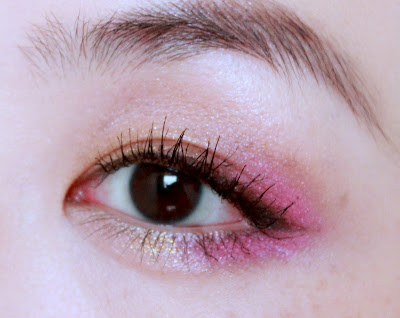
 |
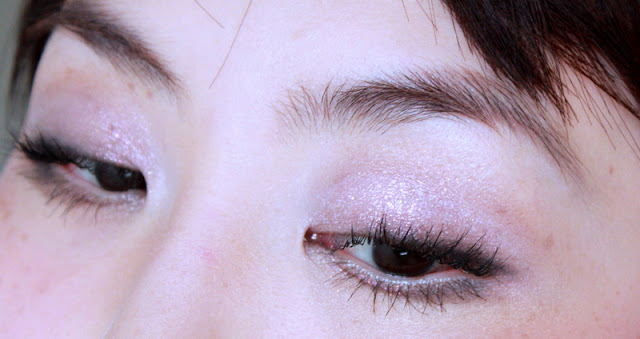
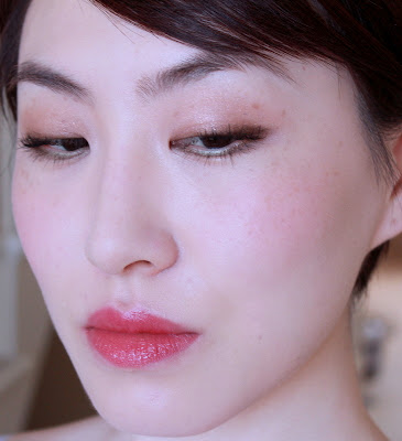
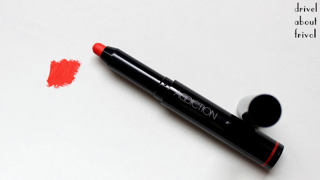
| eyes: Addiction Soda Lunch cheeks: Chicca09 Feels Love, very lightly |
Revlon Fire&Ice and Strawberry Suede (dc); Lancome Corset, Addiction Revenge cheekstick, Chanel Genial (dc) again, Guerlain Colére.